 |
|
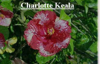
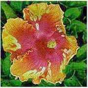
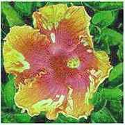
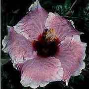
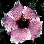
| The original TIF-image converted to a JPG | Final 180 x 180 image |
IMAGE EDITING WITH PAINTSHOP PRO
I find this the best picture editing programme as it needs the least steps. I don't use all the features because of time constraints usually. I hope the steps seem simple enough. Have fun experimenting with other features in PSP.
Every image here had, as a last step, IMAGE-NORMAL FILTERS-SHARPEN applied once, some twice as a couple were a bit "rough". Thanks to Sean Mohme at Strictly Hibiscus as I've grabbed all the pictures from his site...except for my initial ones. They all have been resized...rather IMAGE-RESAMPLE-180 x MAINTAIN ASPECT RATIO as 4 fit across the page at that size. Saving details were FILE-PREFERENCES-JIF/JPG the DP1 100 and COMPRESSION 60. (A dpi of 64 will give you a smaller file if your web-site allowance is a bit cramped)
The only other tool I've used is COLOURS-ADJUST and only 4 of the choices. They are BRIGHTNESS (B) / CONTRAST (C), GAMMA CORRECTION, HIGHLIGHT (H)/MIDTONE (M)/SHADOW (S), and the RED (Rd)/GREEN (Gn)/BLUE (Bl).
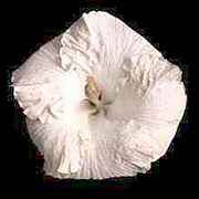
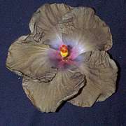
STARTING FROM SCRATCH with a digital image either from a flat-bed scan or a digital camera gives you something like this:
|
|
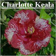
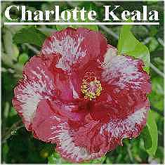
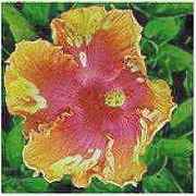
| The original TIF-image converted to a JPG | Final 180 x 180 image |
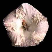
A quick crop is necessary...use the dotted RECTANGLE TOOL in the tool bar and then over on the left change it to a SQUARE if that's convenient. Then, you'll see I've done a 1.4 gamma correction, then a Brightness +5, Contrast +15, followed by a RESAMPLE 180 x 180.
 |
 |
|
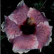
| The square crop job | Gamma correction 1.40 | Brightness +5, Contrast +15 |
TEXT Click PSP's big A and you get a text box. Choose font and size, type your text in the box, click OK and it appears on the page. Left button drag it into place. Right button click to finish. If not right, EDIT-UNDO allows you to drag it off the picture then delete it and re-type with font change, etc.
The following pictures are just a few hurried examples of what can be done with images you are given...I'm glad I'm laid up and have a bit of time!!... I don't know some of these and I'm flying blind a bit on colour expectations!! Take the original image yourself and edit it with my details for effect. You might get an even better result if you then try some changes of your own. Remember to save image1 as image2 then image3, etc., so you don't have to go back and start from the beginning. Delete the unwanted ones afterwards. EDIT-UNDO will allow you to undo your last step if you have to at any time.
 |
 |
 |
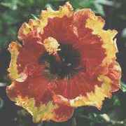 |
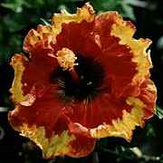
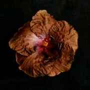
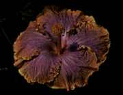
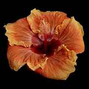
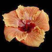
| Byron Metts - a full 2.00 Gamma correction | Ring of Fire Brightness +20, Contrast -20 | ||
 |
 |
 |
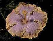 |
| Wallflower - +2.33 Gamma correction!! | Stormy Moon - another +2.33 job with Gamma | ||
 |
 |
 |
 |
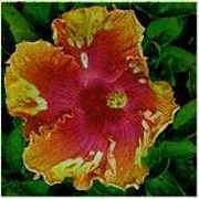
| Charles Schmidt +1.7 Gamma | B.... +5; C....-10. | Rd..0; Gn..+15; Bl..-5 | |
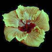
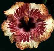
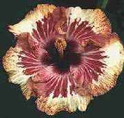
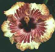
Here're a few but I don't know what final colour I should have for some. Notice how adjusting green and blue helps the yellow. Sometimes, only a little improvement is obtained but that's enough.
 |
 |
 |
| 4th of July with 1.49 Gamma, and H 80, M 40 and S 5 | ||
 |
 |
 |
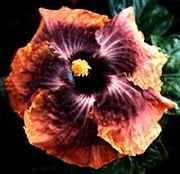
| Jayella with 1.7 Gamma, Rd -30, Gn +20 and Bl +10 | ||
 |
 |
 |
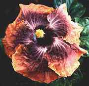
| Mood Indigo B +10, C -10; and Rd 0, Gn +15, Bl -5 | ||
 |
 |
 |
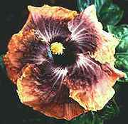
| Old Punta B +10, C -10; and Rd 0, Gn +15, Bl -5 | ||