Scatter Diagram
One possible explanation for some of the scatter is that the relationship of weight to height may be different for women than for men. Suppose women of a given height weigh less, on the average, than men of the same height. Then the overall relationship between women's weights and heights might be represented by a line or curve below the corresponding curve for men, and this in itself could account for some of the scatter. To explore this hypothesis, we could look at separate scatter diagrams for men and for women, but all of the information can be conveyed on a single diagram in which points for men are represented by a different symbol than points for women. Although there is much overlap, the diagram shows that women tend to cluster to the lower left (shorter and lighter), and for any given height, women tend to weigh less than men. Using an identifier to represent values, or brackets of values, of a second independent variable in a scatter diagram is often a useful diagnostic tool.
Scatter Diagram with Identifier
Of course, considerable scatter remains. Even if we had the data on additional potential explanatory variables, however, we would have trouble graphing their joint effects: we must wait for more powerful analytic tools.
Correlation
If high values of one variable accompany
low values of another (and vice versa), the variables are negatively correlated.
For example, low inflation tends to accompany high unemployment, and high
inflation tends to accompany low unemployment; therefore, inflation and
unemployment are negatively correlated.
If most of the observations have x and y values
that are jointly above or jointly below their means, the covariance will
tend to be positive. If, on the contrary, whenever x is above its mean
y tends to be below its mean, and vice versa, the covariance will tend
to be negative. To find the correlation coefficient, we next
divide the covariance by the product of the standard deviations of the
two variables. A correlation coefficient of +1 represents a case where
the points in a scatter diagram all lie exactly on an upward- sloping straight
line; a coefficient of -1 represents a case where the points all lie on
a downward-sloping straight line. The correlation coefficient for height
vs. weight is +0.745. two variables are linearly related. It is a pairwise
measure: if you have three variables, x, y, and z, you can compute the
correlation between x and y, between x and z, and between y and z. These
pairwise correlations are often presented in a tabular form that is called
a correlation matrix." Table 1.4 gives a sample correlation matrix of height
vs. weight.
Since the correlation of x vs. y is the1.000
same as y vs. x, a correlation matrix typically gives the correlation between
a pair only once.
Simple Description of Effects
We observed in Figure 1.6 that height and weight are positively correlated and this relationship holds true for women as well as men. If we want to specify these relationships m* a quantitative way, we could list the average weight of men in one-inch height increments, and do the same for women. At the opposite extreme, we could assert that each additional inch of height is accompanied by an average of four additional pounds for both men and women, but that women of any given height weigh 25 pounds less, on the average, than men of the same height. If the relationships among height, weight, and gender were adequately summarized by the preceding assertion, we would call the relationship linear and additive. woman's height is accompanied by the same average increment in weight, reationship between height and weight for either sex is graphed as a straight ine: it is linear. Furthermore, for a man and a woman of the same height, the an's weight, on the average, is asserted to be 25 pounds greater tha ' n the nches tall or are both 72 inches tall. gender is additive. hile linear and additive descriptions of relationships are simple and intuitive, they are not necessarily right. Looking at the same data, one could instead assert that weight should increase with the cube of height, since height is a linear measure and weight a volume measure. Careful analysis of the data might reveal that this nonlinear relationship provides a better description.
Time Series
When time is the only independent variable, the time series reveals the values of some dependent variable over time.
The graph reveals two characteristics of this
time series:
1- There is a pronounced seasonal pattern: sales
shoot up in December and then decline precipitously in January and February,
before returning to a more normal level for the rest of the year.
2- There is a steady upward trend: the December peaks are higher each year, and even the January-February troughs are generally higher; in between, the level also tends to increase with time.
Trends and Seasonals. How can we capture the trend and seasonal effects graphically and display them more vividly? One simple device is to lay out a twelvemonth scale on the horizontal axis and display individual line graphs for each year. This is done in Figure 1.8, which shows that each year's data moved higher on the graph, and that there was a pronounced seasonal pattern within each year. Would this display help you forecast retail sales for December 1988? Why or why not?
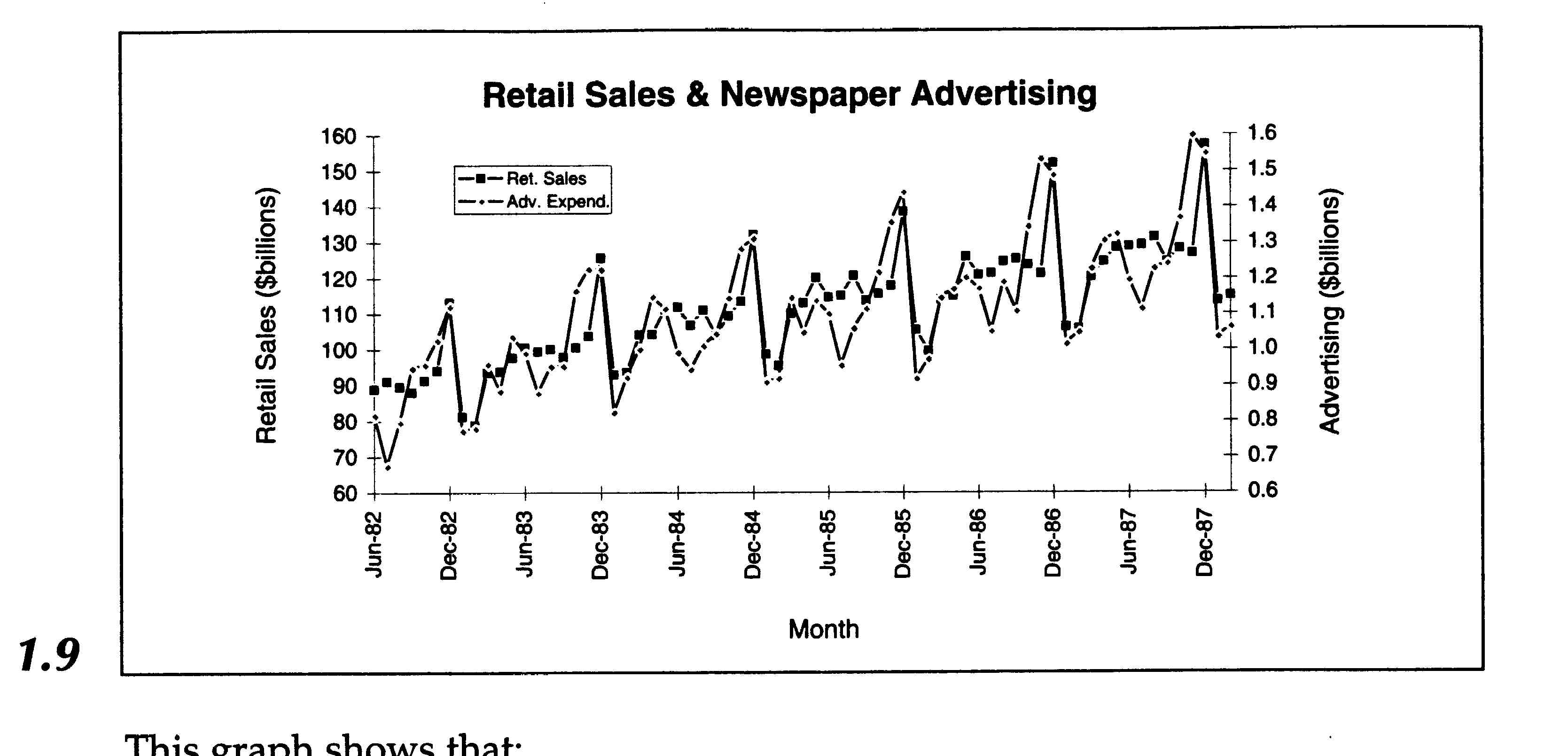
Multiple Time Series. Often,
when we are trying to understand the behavior of one time series, we introduce
another time series to serve as an independent variable. In the retail
sales example, we could introduce advertising expenditures over time as
an independent variable to help explain how retail sales change over time.
We might hypothesize that the stores' advertising expenditures generate
sales. Figure 1.9 shows both retail sales and advertising as time series,
with different scales for the two series.
This graph shows that:
- Advertising expenditures constituted roughly
1% of retail sales dollars for the entire period.
- The seasonal pattern of advertising expenditures
closely mirrors that of retail sales, except that advertising expenditures
build up to the December peak more gradually, increasing more in October
and November and less in December, than sales do.
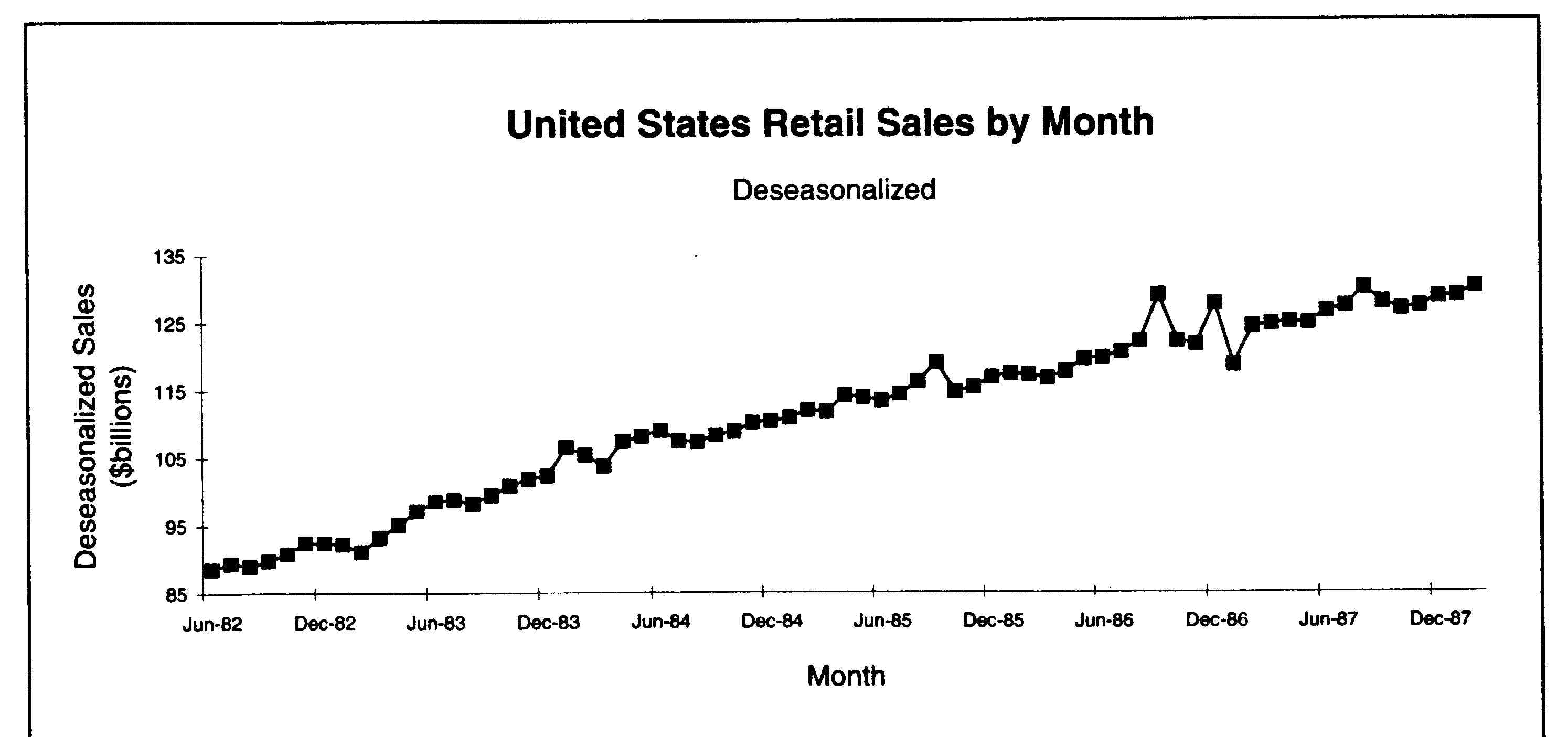
Deseasonalization.
Because so much of the month-to-month fluctuation in retail sales is due
to purely seasonal effects, it is common to report (and think about) sales
on a deseasonalized basis. The fact that January sales are below the previous
December's is not in itself cause for despair; what you would really like
to know is the trend in deseasonalized sales. We shall learn later how
to take seasonality into account in forecasting; for now, all you need
to know is that retail sales and many other time series that exhibit strong
seasonal effects are reported both in natural and in deseasonalized form.
Figure 1.10 is a graph of deseasonalized sales. From that graph, you can
more easily detect trends in the data.