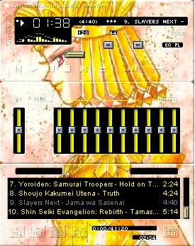
| Sailorgalaxia Amp
|
Comments: I really like the picture of Galaxia that I used. The colors that I used as settings are okay, but I probably shouldn't have used that one bright yellow color. Darker shades would have probably looked better. There is a small section that is kind of messed up down near the playlist, but it isn't really noticeable on this skin. |
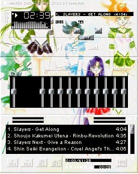
Sailorsaturn Amp

|
Comments: The picture of Saturn is really nice, and the way I made the backgrounds match the color of the picture background looks great. The only problem is that the playlist is messed up. It doesn't really take away from the skin all that much, it just bugs me more than anything. Overall, this is one of my best skins (not just 'cause Saturn's my favorite), despite the fact that the playlist is messed up. |
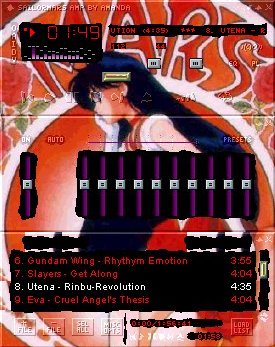
Manga SailorStars Amp
|
Comments: I like the picture, but the skin really did not come out all that well. Pluto's head is somewhat cut off, and Mercury's got a button in the middle of her head. The buttons are hard to see because of the light background of the picture. If that doesn't beat all, the playlist is messed up to. It's not as bad as the Saturn Amp playlist, but it's still messed up. |
Sailormars Amp
|
Comments: I'm not so sure that using purple, which is one of Mars' colors, in this skin was good idea. It doesn't blend in very well with the rest of the skin, which is mainly red. The skin is okay otherwise, though. |
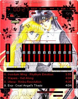
Minako and Rei Amp
|
Comments: I really like this skin despite the fact that there is a lot of red in it. I'm not very fond of the color red. Even so, this skin came out very nicely. I just wish that the playlist wasn't messed up. |