|
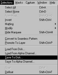
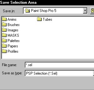
. This gives a nice rounded gold effect and a fake reflection in some of the characters. Just watch the left side of the letters. Look at the brightness of the characters, like they're really shining! . 1. Start by opening a new image, 400w X 200h pixels, set for 16.7M color picture, and black background. Set foreground color for white. . 2. Type a text which fits the screen. Take a nice full font and type it not too small. (I used "Caligula" or you can set your font to 100 pixels in the type size) . 3. Save selection to disk, you'll need it later on.. . *How to Save Selection* Click on selections on the menu bar Click on Save... Name your file and save it with the .sel extension
. 4. Release selection, and select Image/Blur More. After that Dilate the image 3 times. When the insides of the characters (for example the inside of the 'O') disappear, select a larger font, you can always resample the final text. Also when the individual characters start dilating into each other, select a wider/larger font. . 5. Load the selection again, *How to Load Your Selection* Click on Selections on the menu bar Click on Load Select your 'saved' file Click ok Select Colors/Adjust/Brightness/Contrast and set to -20 (brightness) and -10 (contrast). It will look similar to this.
6. Release selection, and select all again by choosing; "Selections/Select all" and then "Selections/Modify/Transparent Color" and set the transparency to black. . NOTE: If the inside of the characters aren't selected properly, select a larger font or try setting the tolerance level to 5 when modifying the transparency.. (for lacy or airy fonts, try setting it as high as 35) . 7. Now, select "Special Effects/Cutout". Uncheck "Fill interior" and choose Black as your shadow color. Set your Vertical to -8 and Horizontal to 8. . The opacity should be 90 and the blur 10.. When you've chosen a more dense font, take "-6" and "6" as your vertical and horizontal parameters. Using the "Caligula" font, I used "-8" and "8". It will look similar to this.
. 8. Choose "Special Effects/Hot Wax coating". Make sure your selection is still around your text. . 9. Now brighten up your selection using "Colors/Adjust/Brightness/Contrast" and select Brightness 16 and Contrast 10. When you like a less bright gold effect, choose 12 or 14 for your Brightness. I used 12 and 10 on this image.
. 10. Colorize your image with Colors/Colorize and set Hue to 24 and Saturation to 240. You want some less gold, try 24 and 204. Try some other values here, to give your font a different look. I used 24 and 150 so it wouldn't be quite so bright and then I sharpened it once for clarity.
. 11. (Optional) Resample your picture to a smaller size, and sharpen it once. You could also sharpen your picture without resampling. But if you resample, sharpen it afterwards! Or else it loses it's sharp golden touch. I only cropped the above selection, I decided not to resize it smaller. . This method also works well on some special brushes, not just fonts! So, be sure to try it on lot of different things and try lots of different fonts to see what effect it hads on them. You can even try adding another coating of hot wax after you're finished to fonts that are very open and see what happens! <wink> I've had some pretty awesome metallic effects that way. . ok.. You're done!!! Now, if you want to put a different background behind it, then while it's still a floating selection, go to Selections/ "Promote to layer" and then it will be a new layer above the black background. But I'll save that for another tutorial!
Copyright � 2000 by [email protected], all rights reserved
This site is sponsored and maintained in its entirety by Artists4psp Copyright � 1998-2001 by Artists4PSP, all rights reserved Artists4PSP Home Page | Join our Group | Contact: LdyArchrr
|


