EARLYDOORS - CHESTER CITY FC REVIEW
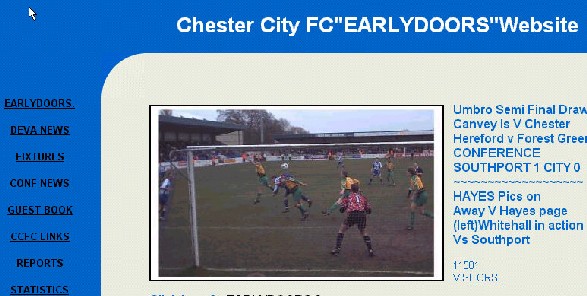
Oh, dear the front page of this site does not bode well for a good website, the use of colour is poor, the fonts used are also not very pleasing to the eye, in fact the page looks very cluttered, the action photograph is not in focus.
The Navigation Bar is down the left hand side of the page BUT the page also has links on the main display. The site looks to be maintained well though with news on the FA Trophy Semi-Finals on the main display.
The news in the DEVA NEWS area of the website is again (how many times do webmasters do this) not justified and the text is in all capitals which makes it hard to read.
The fixtures page is simply dreadful, the scores and fixtures would look much better in a table, the page then would at least look presentable.
Why the webmaster could not have put the Conference Table on himself is unknown maybe he/she/they do not know how to write a table in HTML but anyway the scanned newspaper cutting of the table is shocking, it is out of focus and blurred and basically unreadable.
The same applies for the match reports i.e. the justification problem and thought in the layout, it simply is not very good. The player stats again should of been in a table but they are not and they do not look good.
At last a good point of the website - the Photos page, although the layout again is poor at least the action photos are good and make up for the bad design.
All in all not a very good website, once again this site has been awarded the prestigious
Non-League Review Red Card Award.

RATINGS
| Date Reviewed | 16 March 2001 | ||
| Layout/Design | 2/10 | ||
| Information | 2/10 | ||
| Statistics | 3/10 | ||
| Speed | 6/10 | ||
| Navigation | 5/10 | ||
| OVERALL | 18/50 |