Dover 'Til I Die
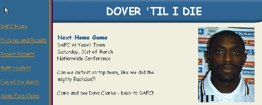
Again for a Dover site the opening page is divided into a left navigation frame and a right main frame. The colour scheme on this homepage is very
pastel, but the colours do look okay together.
The fixtures/results page is plain ugly, the results are not in a table so they are hard to read, the webmaster test should be applied here, the one that says 'does it look good to me?', and if this test was done on the results page the answer would be a resounding NO.
Nice to see the Webmaster use the Red Card referee on this page, because this site is another one of the Non-League Red Card Award sites.
The match reports have potential but as the webmaster says himself, he has a lack of motivation to do them, and on the most part they are very biased especially the Telford Utd review.
Having said that the site does have potential as the webmaster is only 17 years old, if he continues to develop his web designing skills he could make this site into a good one but a change of providers is needed to do this.

RATINGS
| Date Reviewed | 26 March 2001 | ||
| Layout/Design | 3 | ||
| Information | 3 | ||
| Statistics | 3 | ||
| Speed | 5 | ||
| Navigation | 5 | ||
| OVERALL | 19/50 |
TO READ OTHER Dover Athletic REVIEWS PLEASE CLOSE THIS WINDOW AND CONTINUE FROM THE WINDOW LEFT OPEN BEFORE.
Any views on this review please send them to [email protected] thanks