 Related - Text Stories:Swimming in Blood, Love like Water
 DEVLIN WAUGH is a stunning, charismatic character
He is a spiritual assassin and freelance exorcist, working mostly for the Vatican.
Devlin Waugh is the creation of John Smith and Sean Philips.
The pair have collaborated before. They first combined on episodes of New Statesmen for CRISIS and later created the controversial series Straitgate for the same comic magazine
But Devlin Waugh is easily their best work yet - blood claustrophobic thriller guaranteed to gnaw t at the imagination.
Here's a few quotes from the description of Devlin in Smith's original synopsis:
"Devlin is 59,tall and stocky, a build more like a wrestles than a priest. He smokes mentol.
He's also terrified of growing old, and regularly using steroids.
Devlin vaguely resembles a modern Charles-Brosnon"
Above details came from article in Judge Dredd Megazine #1 Vol 2.
A scene from Swimming blood - 682x408 JPG 71 KB.
|
Delvin Waugh Series Index
All Stories by John Smith |
|---|
| Title |
First Published | Art/Colour | Reprints | |
| Swimming in Blood | JD Meg. Vol 2, #1-9 |
Art by Sean Philips | Graphic Novel
Images: part3,part3, part4, part5 |
| Brief Encounter | JD Meg. Vol 2, #26 |
Art by Sean Philips | Best of 2000AD special edition #3 |
| Fetish (with Judge Dredd) | JD Meg. Vol 3, #29-31 |
Art by Siku | Hamyln Graphic Novel
ISBN 0-600-59432-7 |
| Chasing Herod | 2000AD #1149-#1157 |
Art: Steve Yeowell, Colours: D'Israeli | |
| Reign of Frogs | 2000AD #1158-#1165 |
Art: Steve Yeowell, Colours: D'Israeli | |
| Sirius Rising | 2000AD #1166-#1173 |
Art: Steve Yeowell, Colours: D'Israeli | |
Spin-off Series:
PussyFoot 5 | 2000AD #1184-#1188 |
art by Nigel Raynor, Colours: D'Israeli | full page IMAGE, 197KB |
| A mouthful of dust | JD Meg. Vol 3, #72-73 |
art by Michael Gaydos (B&W) | The second part was misprinted first time, and then the corrected megazine #73 was buddled with Issue #74 for free. |
Spin-off Series:
PussyFoot 5
Alien sex fiend | 2000AD #1251-1256 |
art by Steve Yeowell, Colours: Chris Blythe | |
| Red Tide | JD Meg. #201-213 |
art by Colin MacNeil | Ten years on, the sequel to Swimming in blood |
| Vile Bodies | JD Meg. #227 |
art by Colin MacNeil | |
|
|---|
Devlin Waugh Text Stories
- Body and soul. - Judge Dredd Yearbook 1994
- Love like blood. - Judge Dredd Mega-Special 1993 No.6
The making of Devlin Waugh: Swimming in Bloodfeature first appeared in Judge Dredd Megazine Vol II #25/#26
To look at the making of Devlin Waugh, this feature focuses on three specific pages from the 78-page, following them from John Smith's original script, to Sean Philips' initail page layout sketches, to the final, fully painted artwork.
 The creation of Devlin Waugh was the culmination of several previous collaborations between John and Sean. The pair worked together on material for CRISIS magazine, most notably the controversial Staitgate series.
By the time they came to wrok on Devlin, John and Sean had developed a strong rapport. This enabled John to write tighter scripts, not needing to fully explain the sort of artwork and page layout he envisaged.
The first page to be examined in detail is page two, from the third episode of the series. It cross-cuts between Devlin's quarters in the underwater prision nick-named Aquatraz, and the infirmary, elsewhere in the prison.
Here is John's description of the final panel:
'Turning over a tall impressive picture, running the full height of the page. We've returned to Devlin, carrying on from the previous two panels... only this time we're looking at him straight on, fully visible.
'He's sat cross-legged in a wing-backed chair, holding a dainty China teacup between finger and thumb. He's surround by plants - ferns and orchids - adding an extra touch of colour. He looks almost angelic amongst the greenery.'
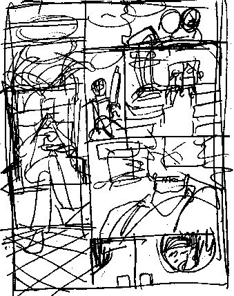
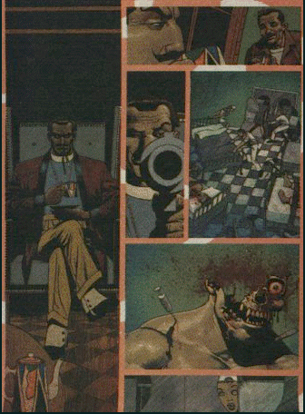 Compare this with the 'thumbnail sketch and finished artwork. In the sketch's Devlin's loose outline is visible in the wing-backer chair, with the checkerboard floor pattern already obvious. In the final artwork Sean has added a table with teapot to explain why Devlin is drinking a cup of tea. All greenery is condpicuous by its absence!
'2. A two-shot, moving round to look at both Devlin and Murray - sat beside him, stirring a cup of black coffee with a pencil. Maybe we're behind Murray, looking at Devlin in profile.'
Here John suggests two different angles, which Sean combines by going for coffee is telling the artist more about the character of Murray, that what should be seen in this a single panel.
'3. Back ro Devlin, looking at him straight on, from about the waist up. He's holding up a sawn-off shotgun, a squat menacing-looking thing with added Devlin touches:gold trim, jade intaglio... that sort of thing. Devlin is pointing the gun straight out at us, giving us a coy look, one eyebow raised.'
In Sean's initial sketches, Devlin is simply holding his gun aloft. But for the final art, we've moved closer in, with the gun aimed straight at us, as per the script. Rather than a sawn-off shotgun, Sean paints something more tasteful and in keeping wit the character.
The three remaining panels take place inside the the prison's infirmary, with Sean following the script quite closely.
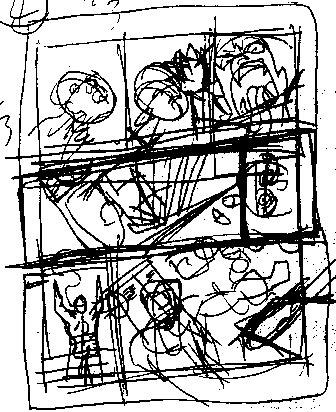
The second page to be examined is from the fifth episode of the series. John's scripts are ususual for being very specific about the nature of the violence they portray, with a mass of details included.
Often these details don't make it to the final art, but contribute to creating the sort of scene he's after in the artist's mind. Often John's panel descriptions are as much about the mood and atmosphere of a panel, as about the specific nature of what he wants to be visible in it.
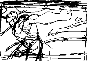
The most interesting panel to compare and contrast from this page is the final one. It can be seen as part of the general page thumbnail above left and in a more detailed, seperate sketch made by Sean (above left)
'7. Cutting to a front-on shot of Devlin. We're in one of the prison staffrooms: lockers, a coffee percolator and TV, table and chairs, posters on the walls. Maybe it's one of the staffrooms we saw earlier in the story: chairs overtuned, bloodstains dotted around... the aftermath of a fight.
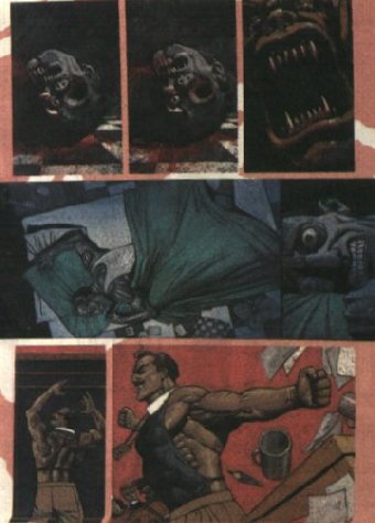 'We're concentrating on Devlin, at the moment. He's moved over to the table of the side of the window, sweeping everything off it in a sudden gesture of petulance. He'd consumed by self-pity, ranting on at the crowd. [The crowd being Murray, Essex, Kinsey and everyone else.]'
In the full page sketch, Sean has included much of the background detail, like the lockers, posters, incidations of other characters in the room. However, he was obviously undecided about how to visualise Devlin sweeping everything off the table, with the table being tried at the different angles within the panels.
From here Sean did a more defined sketch of just the final panel, closer to the final version. Devlin is sweeping the items away behind him, papers and other items flying into the air. By the final version, a few background characters have been added butthe lockers and posters have disappeared, as has Devlin's cigarette holder from the second sketch.
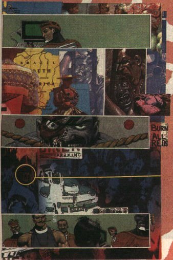
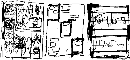 This page presented several challenges for Sean, as John asked for seven panels involving five changes of scene and up to a dozen different images to included in the final artwork! John Smith's scripts are well-known among British comics' artists for providing such challanges.
Sean needed several attempts just at drawing out layout sketches to get an idea of how to set out the page, as is the finished artwork. Here is the panel descriptions for the first panel...
'1. A shot of Kinsey, sat in front of a computer terminal, his back to us. On the VDU in front of him is the futuristic equivalent of a criminal mugshot: two photographs of Landis - front and side-on - with a brief list of pertinent details. It starts off with the emblem for the Bahamas Justice Department, and under that the legend - LAW:NET CENTRAL JUSTICE DEPARTMENT.'
This panel is actually one of three set in Devlin's quarters in the underwater prison in Aquatraz. At first Sean tried laying out the page as a conventional, sequential comic strip. Unsatisfied witth this, he decided to focus on the three panels (panels 1,4 & 7), palcing them to form a symmetrical layout.
Sean attempted this by running the three panels diagonally down and across the page. Finally he settled for a montage of images making up the other four panels, which would be 'bleeding' off the page at the top and sides. Here is how John requested the use of the montage...
'2. First in a sequence of flashbacks, as we illustrate Errol's story. We should use some nifty technique to seperate the here and now: colour-coding the pictures, or filling the gaps between the panels black... or red or brown or whatever...maybe the colours becoming bloodier as we progress.'
In the end Sean used a photo-montage technique with airbrush colour over the top to differentiate from the strip panels set in the prison, as he seen in the finished artwork shown on this page.
Back to 2000ad contents page
 DEVLIN WAUGH is a stunning, charismatic character
 Compare this with the 'thumbnail sketch and finished artwork. In the sketch's Devlin's loose outline is visible in the wing-backer chair, with the checkerboard floor pattern already obvious. In the final artwork Sean has added a table with teapot to explain why Devlin is drinking a cup of tea. All greenery is condpicuous by its absence!


 This page presented several challenges for Sean, as John asked for seven panels involving five changes of scene and up to a dozen different images to included in the final artwork! John Smith's scripts are well-known among British comics' artists for providing such challanges.