Speed Painting 101 for Painters Who Have No Patience
By Tom of Norway
A compressed yet expanded version of the painting tips on my site, written for Ral Partha's Eye of the Storm e-zine.
Being a document describing some ways to greatly speed up the rate you can churn out
nicely painted figures so as to get that enormous army on the field in no time at all and
impress all your friends and rivals with how well painted they are.
-Note: I use mainly "Miniature Paints" from
Gamecraft (also sold under the "Warzone" and previously "Leviathan"
labels) and the old type Citadel. (These are very similar, and I have heard that they are
made at the same plant). I prefer these over Ral Partha or Armory paints, as I find the
latters to be too "dry" and "chalky". Drybrushing usually looks better
if the paint is not too "chalky". On the other hand, "chalky" paints
tend to cover better in just a single coat, even on top of black.
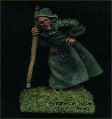
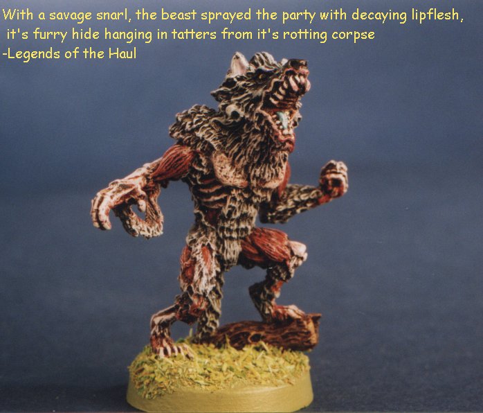
I rarely spend much more than an hour or so on a figure, two or three tops (The
Zombie Werewolf took about an hour in all, excluding the time
the spray primer took to dry...
I usually paint to a "tabletop plus" standard, in which the figures look great
on the tabletop, and usually stand up quite good on close inspection. This isn't really
all that more involved than the "Q-Tip Slop'n'Go" standard many people nowadays
seem to use on their armies.
And the best thing about this is that it really doesn't require much more than a steady
hand and some knowledge about how the different paints you use actually work.
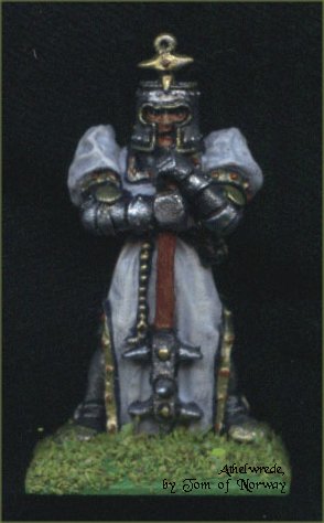
 Take a good long look at the pictures in my galleries, the miniatures were
all done on a black undercoat, using the techniques I present below, and most in less than
an hour each.
Take a good long look at the pictures in my galleries, the miniatures were
all done on a black undercoat, using the techniques I present below, and most in less than
an hour each.
The examples below took alot less, as they both were mainly dress or cape in one colour,
with skin and just a few other bits in addition to that).
Several tricks can seriously cut down the time taken
to paint a miniature to an acceptable standard. Without further ado, here are some of
them:
- 1. Use a black undercoat
- This is the single most important factor in spending less time painting a figure. Using
an opaque black undercoat lets you cheat. It really is as simple as that. By cheating I
simply mean that it is not as imperative to cover every teensy little bit of miniature
with paint, as a sloppy coat of paint (such as not covering up to the edges properly)
usually won't show up as much on black as on a white undercoat, simply because you can get
away with it being seen as a part of the shading or outlining, while white that shows
around the edges will invariably be seen as sloppy painting! Of course this all depends
somewhat on your individual style...
When priming or undercoating with black it is important to get a completely opaque coat
that will give a good base to work on. If you use a spray can or such, it will usually be
necessary to give a second coat from a different angle (such as laying the figure on it's
back to get at the "under the chin" bits, if you see what I mean...) so you
don't get metal shining through down in the crevasses and in the detail, as this will
totally ruin the effect.
When the undercoat is completely dry (I usually prefer to let it dry overnight), you
can start slopping paint onto the figure. Sometimes it will be necessary to paint some
black in the aforementioned deep detail, to cover completely if the undercoat wasn't good
enough first time around.
One of the simplest ways to cut down on the time spent is to let the black show around
the edges of a colour, at the points where different colours meet. This will create an
"outlining" effect, without having to fiddle around with those tiny brushes that
keep drying out all the time...
In many cases the undercoat can also be the overcoat...(a really bad pun there, sorry).
Simply let the relevant part of the figure stay black. After all, "Tactical
Black" has been and is still used by many armed forces. But beware of overdoing this,
keep it to smaller bits like boots, gloves, hats, maybe even polearms' poles etc. Note
that most figures get rather boring if they are all black, especially if the same is true
for an entire army on the tabletop...Almost as boring as using unpainted figures, so what
is the point in going to all the effort painting them then?
Most metallic colours, such as chainmail and gold, also benefit from a black undercoat,
as they look far better with a dark base coat beneath. Most painters use black for this.
And with a black undercoat, you have eliminated the need to paint the areas black first
already.
The key to painting on a black undercoat is to know and
understand how the individual colours actually perform in practice. Many people say that
using a black undercoat restricts the range of colours that you can use. This is mainly
because many colours suffer from poor coverage, especially "warm" and
"bright" colours, such as most reds, yellows, greens and so on. If you try to
paint with such a colour directly on top of a dark undercoat, the colour will often turn
out dark, muddy, and horribly blotchy. Luckily, there are ways around this...
One way that is often proclaimed is "simply paint it white beneath to get the
colour you want". Sound advice, but it, too, has it's drawbacks. When doing this on
an otherwise black undercoated figure, I have found that the bright colours turn out far
too pale! Not to mention that the white also needs to be perfectly opaque, or you get
muddy colours anyway...
What I do is use paler versions of the colour I want
beneath. The paler colours usually have far better coverage on black, often giving an
opaque colour in a single coat. This also helps to enhance the actual colour that you want
in the end; since the bright colours are somewhat transparent they will let the colour
that is beneath show somewhat through, and when what is beneath basically is the same
colour, this will brighten up your day no end! So I simply repaint the pale colour with
the desired bright colour, and volia! A strong and bright red or yellow (or whatever) in
only two coats (three, tops) on top of black, instead of seven or more coats ending up
with a dark, muddy colour, not to mention a thickness of paint that will fill in any
detail present...
Another thing to keep in mind is that this is also true when drybrushing. If you have ever tried
to drybrush a bright colour such as red onto black, you will probably have found that you
needed umpteen coats before the thing finally turned brown, and if you tried drybrushing
white beneath first everything turned rosy pink...which would be fine if that happened to
be the effect you wanted...So here is a short list of good colours to use beneath the
bright ones you want:
| Top colour |
colour to use beneath |
| Yellow |
Bone or Cream |
| Red |
Chestnut brown |
| Bright Green |
Pale Green |
| Flesh |
Peach or pale orange |
| Whiter than White |
light blue |
| Offwhite |
Brownishgreybeige |
| Silver (metallic) |
Dark Blue |
| Gold (metallic) |
Dark Brown |
Please note that these are generic names for colours and not necessarily the ones found
on the paint pots... (also, if a name on this chart is difficult to read, try highlighting
it with your mouse's left button...)
- 2. Use a large enough brush
- This is very important. A common mistake is to use far too small a brush. What usually
happens is that the paint starts to dry before you are finished applying the coat, and
stripes and lumps are created when you happen over the half dried paint. This is very
unsightly and ruins alot of good paint jobs. Also it takes much more time to apply a coat
with a small brush. If you use a large enough brush this usually does not happen as you
finish applying the coat much faster. Just be careful to avoid clogging up any detail.
Remember that you only need a good point on a brush for detail, for the basics that is not
as important, as long as the brush isn't frayed or makes wierd textures. If you miss, you
can usually go back and fix it later.
- 3. Paint the figure "from the inside out"
- "Dress the figure up", painting the innermost colour first, working outwards.
This lets you paint smaller and smaller areas, always on top of the details. This will
also reduce the risks of missing and messing up when painting inbetween the detail (as you
won't have to!). The only exception to this is if the figure is predominantly clad in
armour, in which case do the armour first, as the metallic paint has a tendency to go
everywhere and ruin a perfectly good skin job.
- 4. Keep it neat
- This is perhaps the single most important piece of advice you can get whatever method
you use to paint. Nothing can ruin an otherwise well painted miniature than colours that
"cross the borders", such as flesh colour getting on the the sleeve of an
otherwise white shirt, eyeballs going all over the place, or base green riding up the
boots.
Make sure that all colours end where they are supposed to end, with straight and sharp
edges, and you are a long way to miniature greatness. A good way of doing this is by the
technique called "outlining" (sometimes known as "blacklining"-simply
painting a thin black or dark line on all the places where different colours meet.) Of
course, if you use a black undercoat and have kept it neat all the time, the figure will
effectivly already be outlined, and you will have saved quite some time already!
- 5. Keep it simple
- It is usually a good idea to keep the main colours as few as possible (three or four
usually do the trick). To many colours tend to make the figure (or the viewer!) go into
"kaleidoscope seizure", and seem messy. Also, using many colours takes longer...
- 6. Quantity and quality
- If you are looking at doing a lot of figures, it will usually be a good idea to paint
several in one go. I have found that my limit is about a dozen similar figures at once,
many more than this and none of them ever get completed.
Simply start with the bottom-most colour and do that colour on every figure, then the next
colour, starting on the first mini (which is dry by now) and so on. Unless you cramp up,
this can let you finish the batch in just a few hours. On the other hand,
this also tends to lead to "mechanical" and very similar paint
jobs.
Many people say that the "rank and file" troops are just to be
done in basic colours and only the individuals deserve full attention to
details. This is entirely up to you, the painter. Personally, I like to take
them all at least to the level of proper skin and hair, as the face is most
often the focal point on the miniature, and well done face and hair (including any beards etc)
immediately makes the whole figure look so much better than just
basic colours, even if the rest of the figure is just that: basic colours.
It is simply a case of giving the face and hands (and any other
visible skin) an appropriate wash and a quick drybrush, and dotting
in the eyes and eyebrows. The effect is definately worth it, unless you have
very shaky hands and tend to paint eyes up the figures' noses.
.
I usually paint a single figure from a unit of several completely
first, so I have a "template" of sorts. This
saves some time, as I do not have to make the same mistake (such as using the wrong
colour) on all the figures before going back and having to change them all...Also I find
having a fixed plan knowing where all the colours are to go is quite helpful to expedite
matters.
- 7. Fixing at the end
- One very time consuming chore is to fix all the misses as you go along. This is not
really a good idea, as you may very well miss some more, and be forced to do it all over
again. It is usually best to do all the necessary fixes in one go when the figure is
nearing completion.
- 8. Varnish as highlight
 This is most definately cheating! Both black, white
and metallics will most often highlight and / or shade themselves with some half gloss/
matte varnish such as the "Citadel Matte Varnish" spray. The same goes for gems
and other shiny items (such as slimy monsters or enameled armour). If you use a coat of
gloss varnish on gems or whatever, this will make it's own highlights (quite nicly as
well). It is important that the varnish has that glossy effect, however, as it is the
reflection of the lighting around the miniature that produces the highlight. But be
warned: If the varnish makes cloth-bits on the miniature go shiny, the cloth will seem
soaking wet, or made of plastic. If the varnish is too flat, it will make metallic bits
look dull and non-metallic.
This is most definately cheating! Both black, white
and metallics will most often highlight and / or shade themselves with some half gloss/
matte varnish such as the "Citadel Matte Varnish" spray. The same goes for gems
and other shiny items (such as slimy monsters or enameled armour). If you use a coat of
gloss varnish on gems or whatever, this will make it's own highlights (quite nicly as
well). It is important that the varnish has that glossy effect, however, as it is the
reflection of the lighting around the miniature that produces the highlight. But be
warned: If the varnish makes cloth-bits on the miniature go shiny, the cloth will seem
soaking wet, or made of plastic. If the varnish is too flat, it will make metallic bits
look dull and non-metallic.
- 9. Painting Techniques
- When speed is of the essence, you should not bother with blending, and usually not even
so-called "highlighting" (the techinque, that is). Rather, use washes and
drybrushing. When you master this, you will be churning out well-painted figures in no
time.
- Learn to drybrush, my way
- Use a big stiffish brush (depending on the size of what you are going to drybrush, of
course...you must try be careful not to get paint on the rest of the figure when you do
this). Dip the brush in paint, and wipe it on some tissue. Then wipe again. And again.
Brush with brisk strokes (many times!) back and forth travelling crosswise over the
details to create highlights. The point is simply that as there is little paint on the
brush, it does not flow at all. Instead it just sticks to the bits you draw the brush
across; that's to say the so-called "raised detail". The more pronounced detail,
the better this technique works. This is one major reason the larger, often more
caricaturish "28mm"-scale is growing evermore popular; the sharp and deep detail
on these is simply so much easier to paint!
Usually this method is used to lighten figures, so each
layer of drybrushing is in a lighter tone than the last, and also with a drier brush and
lighter pressure on a smaller area, so as to give a nice blended effect.
With just 2 or 3 tones, you can create great effects.The secret to drybrushing is to know
exactly how much to wipe the brush (And I mean really pinch the paint off with your
fingers (using tissue!) several times. Each colour responds differently. Experiment with
the ones you have. Some colours need only one or two wipes, others several more.) The base
colour also enters into it, as this will have a profound effect on the end result.
Tip: If the paint job turns out stripy, blotchy or clogs up the
detail, you have not wiped enough. If there is no discernible effect, you have wiped too
much.
A softer brush and thinner paint will give a much smoother finish than a
stiff brush and thick paint.
.
There are several variations on this technique that work well for a great many things,
such as using very thin paint or not wiping much, painting on top of wet paint, the
possibilities are almost endless. I use such variations of drybrushing for the
colourblended hides of many of the creatures on my site.
Washes
This is simply put to "wash" an area of a figure with thin,
runny paint or translucent ink, so that it runs into the deeper details and creates darker
areas there, while remaining somewhat translucent all the time, leaving the base colour
showing through. For a wash, the paint should be about as thin as skim milk, depending on
the colour again. Just be careful to draw exessive pools away with a clean damp brush, and
that air bubbles are not allowed to dry (unless you want rings looking like old sores all
over the mini…).
.
When you combine washes and drybrushing (washes for darker shading, drybrushing for
lighter highlighting) you can get really fast results that look very good.
Just be careful that the wash has dried thoroughly before drybrushing, or very wierd things can happen.
.
Remember that colours always seem darker on a small surface than on
a large one, so you might want to use a slighly lighter colour than the one you are
thinking of...
.
To sum up, the secret to working fast on black is understanding which colours will cover
and which will not. As stated before, paler colours cover better. These can then be
repainted with the desired bright colour. From there on it gets easier, simply apply
whatever standard of shading and/or highlighting that you desire in the normal fashion,
there are several good painting guides out there that go through the most used basic
techniques (washes, drybrushing, outlining etc) in more detail. And always use a large
enough brush for the job!
.
An example: The Blue
Witch, Enchantress of the Lake
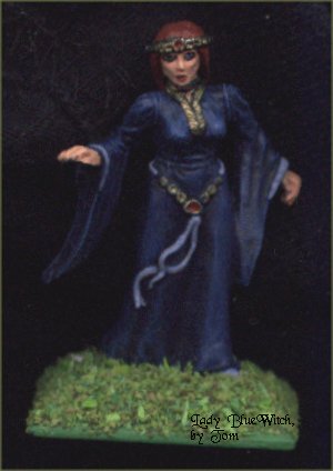 This figure is like the others, painted
quickly using most of the techniques I have described. First, an opaque black undercoat. I
used a brush-on one for this figure, as it was too cold for aerosols outside (chill can
crack the primer and ruin it as it dries...) Secondly I applied a dark blue coat on the
dress (here I did the dress before the skin, as the areas were separate enough to do the
skin without getting fleshtones on the dress, and by doing the dress first I was free to
drybrush that more heavily without fear of ruining a delicate complexion. (And the figure
was definately blue in the face when the dust had settled...). Three layers of
progressively lighter drybrushing later, the dress was basically done. By keeping the
dress in one colour, I save alot of time and hassle. I opted to keep decorations to almost
a minimum, and just did some nice borders on the cuffs, the belt/ ribbon thing (she also
has a ribbon fastening her long braid on her back), and her visible shoe in a light blue/
grey without any highlighting. (Some pure white could have been nice for that, if I had
bothered with it.) The skin was done first in a light fleshtone, carefully and lightly
washed with light red/brown ink. When dry, this was repainted (actually drybrushed with a
very small brush) first with the basic light fleshtone, and then really lightly with a
light cream/ bone colour for the topmost highlights. Eyesockets were painted deep blue,
almost black for dramatic effect, and some very small offwhite dots were placed on either
side of where I wanted the irises to be. (This took a couple of tries. The figure is no
more than an inch tall, for crying out loud!) The inside of the lips were painted deep
red, and her hair was done in chestnut red/ brown, with a very light dusting of orange.
The diadem-thing and her torq, collar and belt were painted metallic gold, with a blob of
deep red paint in the middlemost bits for effect. Finally the base was painted in a light,
neutral green and given a layer of scatter material. . I
wanted to give her an almost cold, no-nonsense look, so I avoided giving her any make-up,
other than the red lips and deep blue eyes. I think the serious look on her face and the
direct stare suggests a strong woman fully in charge of herself, but somewhat wary of the
onlooker; with fireballs coming on-line in a split second if need be... .
This figure is like the others, painted
quickly using most of the techniques I have described. First, an opaque black undercoat. I
used a brush-on one for this figure, as it was too cold for aerosols outside (chill can
crack the primer and ruin it as it dries...) Secondly I applied a dark blue coat on the
dress (here I did the dress before the skin, as the areas were separate enough to do the
skin without getting fleshtones on the dress, and by doing the dress first I was free to
drybrush that more heavily without fear of ruining a delicate complexion. (And the figure
was definately blue in the face when the dust had settled...). Three layers of
progressively lighter drybrushing later, the dress was basically done. By keeping the
dress in one colour, I save alot of time and hassle. I opted to keep decorations to almost
a minimum, and just did some nice borders on the cuffs, the belt/ ribbon thing (she also
has a ribbon fastening her long braid on her back), and her visible shoe in a light blue/
grey without any highlighting. (Some pure white could have been nice for that, if I had
bothered with it.) The skin was done first in a light fleshtone, carefully and lightly
washed with light red/brown ink. When dry, this was repainted (actually drybrushed with a
very small brush) first with the basic light fleshtone, and then really lightly with a
light cream/ bone colour for the topmost highlights. Eyesockets were painted deep blue,
almost black for dramatic effect, and some very small offwhite dots were placed on either
side of where I wanted the irises to be. (This took a couple of tries. The figure is no
more than an inch tall, for crying out loud!) The inside of the lips were painted deep
red, and her hair was done in chestnut red/ brown, with a very light dusting of orange.
The diadem-thing and her torq, collar and belt were painted metallic gold, with a blob of
deep red paint in the middlemost bits for effect. Finally the base was painted in a light,
neutral green and given a layer of scatter material. . I
wanted to give her an almost cold, no-nonsense look, so I avoided giving her any make-up,
other than the red lips and deep blue eyes. I think the serious look on her face and the
direct stare suggests a strong woman fully in charge of herself, but somewhat wary of the
onlooker; with fireballs coming on-line in a split second if need be... .
I apologise for the poor quality of the scans, but I did
them all by myself...
Bah! Enough of this nonsense! Get me out of here!