![]()
Bretonnia is maybe the most fun army to paint for
Warhammer Fantasy. This because you don't need to paint a regiment of 20 men all the same
way. With the Knights you can really let your imagination run riot, using all sort of
colours to make a striking force on the tabletop.
Furthermore, because the Knights have a high point
cost you won't have to paint endless rows of miniatures. The only miniatures boring to
paint are the Commoners, but none will take a real close look at those, so don't strain
yourself trying to make them too flashy.
Painting Commoners is the most boring task of
painting a Bretonnia army. Think before you begin. Choose your colours with care. Maybe
you rather like Yellow and Red, but these colours tend to be harder to paint than Blue and
White.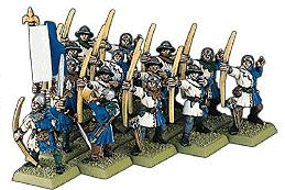
I use on mine a simple but effective colour scheme,
same as Games Workshop, blue and white. This makes for easy and quick painting over a
black undercoat. I try to keep my palette as limited as possible while not compromising on
the end result.
I use on all my Commoners a black undercoat, this saves a lot of time and sweat. Once used to painting over a black underground you can really paint a miniature fast while maintaining a fairly high standard. Even Games Workshop paints some miniatures over a black undercoat.
The knights is where the real challenge and fun lies. If you want your miniatures to look historical correct there are some rules to follow while painting them. The rules are:
- Never paint a metal on top of a metal.
- Never paint a colour on top of a colour.
Metals are - Silver and Gold, represented by White
and Yellow.
Colours are - Red, Blue, Green and Black.
Fairly simple isn't it. Take a look here if you want more historical correct info on Heraldry, Heraldry on the Internet. This site offers anything you'll ever need to know about heraldry.
Maybe you don't care if your miniatures are
historical correct or not, could be. But at least do follow the next rule for painting
Bretonnian Knights. Keep your colours consistent. Normally you use only two or three
colours on a single unit, otherwise it starts to look rather shabby and not at all like a
unit. 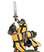
Bretonnian Knights are all painted in a different
heraldry and using different colours, so the unit looks rather frantic already. If on top
of that all the blue's and red's are different from each other it will look like a circus.
Choose for each colour a solid base colour and stick with that. Ofcourse you can use
different shades to highlight or shade that chosen base colour.
For the most part painting these Knights is just a lot of fun, every Knight is a new miniature that can be painted as you like. The most important think is to keep your painting neat and crisp, most of the time a good idea, but even more so when painting Bretonnians. Skaven or Undead don't look less well painting if a little less care was taken on straight lines and such. Bretonnians, same as High Elf's, suffer immediately.
It's just a matter of having a nice heraldry in your head and apply that onto the miniature, don't go overboard with elaborate designs. Keep it simple. Look at how Games Workshop has painted them, most of them have pretty simple designs.
Start with a White undercoat, although i'm a big
fan of undercoating my miniatures black, for these miniatures white is simply the way to
go.
After that i start to paint the horse in it's base
colour. Try to make the colour of the horse fit with the ones of the heraldry. When that's
done the heraldry is painted. Try to make the lines as straight as possible. Unfortunately
the carapace of the horse if blowing in the wind, so you will have to paint in such a way
that it all look natural. This can be a pain, look at how Games Workshop has done it and
try to copy that.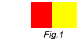
To give the miniature a little more depth try the
following. Where the two colours of the heraldry meet make the two colour darker, this
gives more depth. Look at Fig.2 to see what i mean, Fig.2 has more depth than Fig.1. While
both use the same base colours. 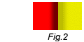
I agree it looks a bit odd on first sight, but when
done on a miniature it really does wonders. Just mix darker red or yellow, or any colour
on which you want to do this, into the base colour and start tracing the edges.
Done.
Now for the Knight himself. Again i undercoat it
White. After that i start with the armour. Paint this all black. After that Dry brush the
armour using Bolgun Metal, or something similar. I find the result of this method better
than painting the armour with a silvery colour and then inking using black/blue. But it's
al personal.
The same colours you've used on his horse should come
back on the Knight too. Use your imagination..:) The real fun is his helmet, try really
your best on it, it's the focus point of the whole miniature. If you aren't to sure about
you're own painting skills don't go over the top, keep it simple. It will look better in
the end.
You can't really go wrong with
Bretonnian Knights. Even if you don't use any advanced techniques and just colour the
miniature it will still look good on the tabletop. The only bad part is you can't soak off
the paint with something like nail polish remover. It will remove the miniature as
well...:)