Synopsis
We were to sign up to design either a hallway of a retirement home in Willamatte Pass or the hallway of the top floor of a Portland Hotel. Each scenario came with specifications and settings to work with. This was our first design process and I must say that I enjoyed it immensely.
Assignment
Main Idea
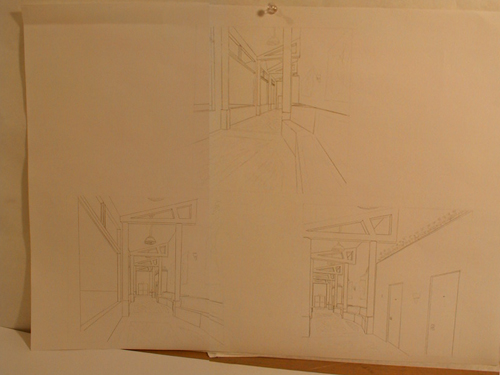
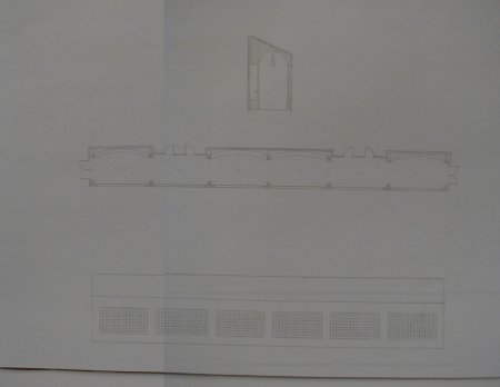
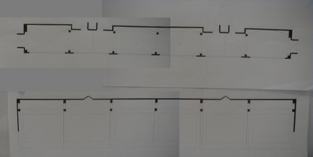
Having missed class two days ago, I didn't get the assignment when it was explained by the professor. But other people explained what was going on to me. Apparently, we were supposed to sign up for one setting or the other with restricted space for each one so there would be an even number for both settings. Since I didn't have to sign up and the two settings were already even, I was allowed to choose which one I wanted to do. I jumped on the retirement home in Willamette Valley since it seemed to be more interesting than the top floor of a Hotel room. I found out later that it was the preferred setting. Kind of lucky I missed class I guess. My general idea was just to open up huge windows down at the southern view and have a bench or alcove for every unit in the corridor. I also wanted the corridor as wide as possible and I brought the width of the corridor to the max. I used what I learned in ARCH201 and put a curve to the benches so that the people would be more or less facing each other, creating a space more seperated from the circulation path. After designing that, I decided the exterior looked to boring so I accentuated the unit entrances by placing dormers above the doors. I also used the columns to show the seperation of the units.
My Presentation
The presentation was rather interesting. We were combined with another studio and presented ours in small groups of four or five. At the end, we were to select one that was the best of the group. Much to my surprise, my project was chosen! Heh... they probably chose it just to spite me so I'd have to present it to the collective. But it turned out the entire group had to present the chosen project so I wasn't alone in the spotlight. My computer work was a combination of a few pieces of 11"x17" paper, all combined on several 18"x24" sheets.


[Previous] [Home] [Next]