
Synopsis
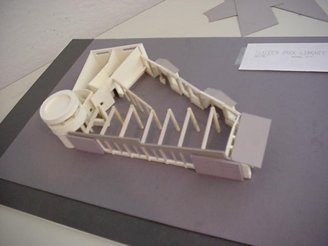
Since the midterm, our job on the design level was to just consider the reviewer's comments and weigh them into our final design. Everything was to have more detail and our facades were to be fully developed.
Assignment
Main Idea
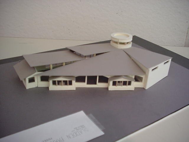
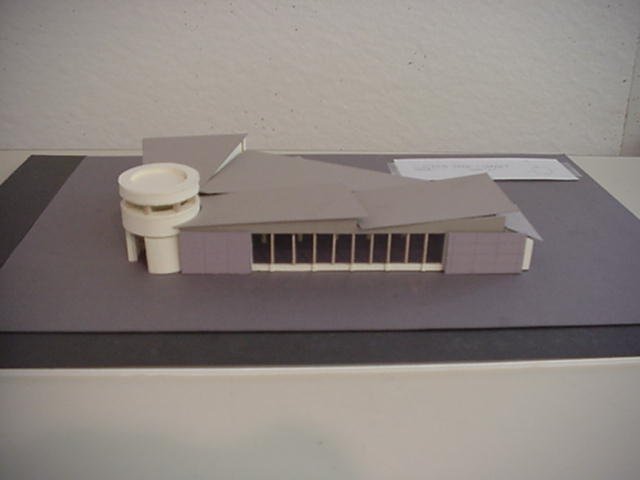
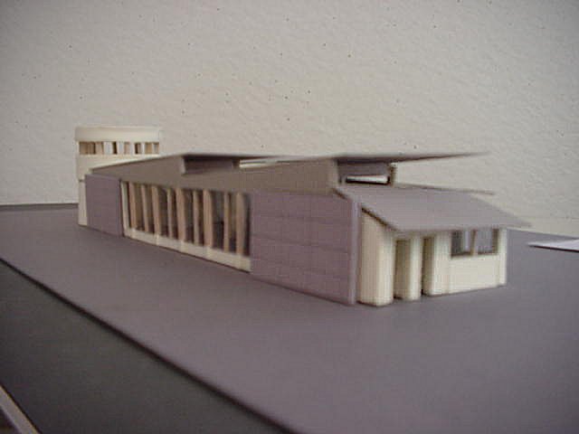
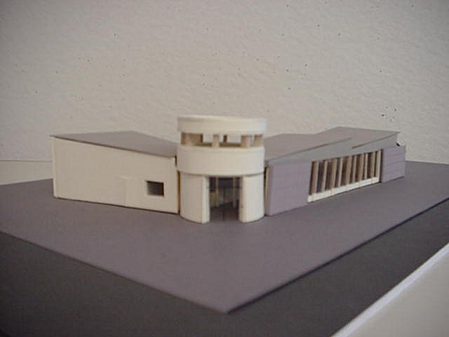
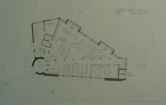
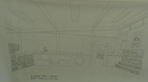
Since the midterm, little has changed. My main focus was to rearrange the administrative space so it wouldn't seem as maze-like. It was rather difficult and I had to sacrifice the bathrooms placed in a more private hallway. I had to add another set of columns for the roof of the adult reading room because the span was too great for a single beam. I finally found a reasonable place to put the columns which was to act as a border between additional stacks and the reading room. I also added more variation to the children's room but it was difficult to show the changes in plan and my section didn't cut through it so I drew a perspective of it.
My Presentation
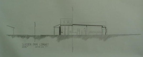
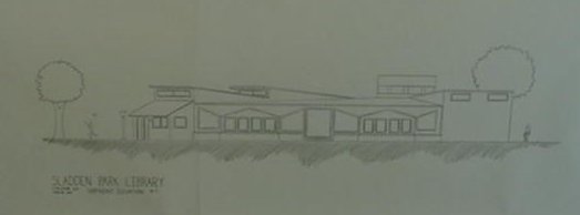
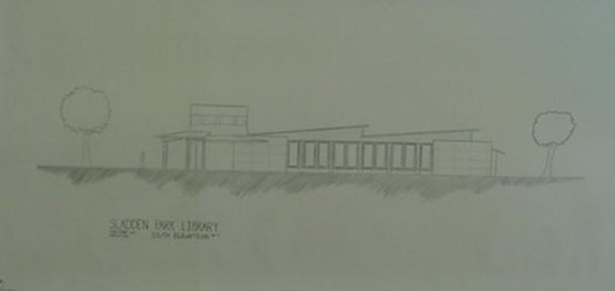
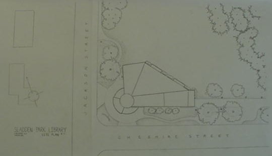
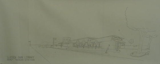
I really enjoyed doing the exterior perspective and the site plan. I believe they were the best pieces I produced. They were both the last two drawings on vellum that I made. The street edge on my plan was a little crooked but other than that, I don't think it was too bad. Both of my sections have bends, attributed to the fact that it is rare to find walls that are perpendicular to each other in my library design. My two elevations are of the two most intriguing facades: the south elevation and the northeast elevation. My layout, however, needs work. They seemed like seperate pieces put together than a whole. It also didn't help that I ran out of butcher paper.

[Previous] [Home] [Next]