
I was heading the Administration Department of the Raffles Model United Nations Conference in 2001 and took it upon myself to make a new logo, because the old was very sucky. As was usual, I had very little time to do everything.

Original, terrible RMUN logo, used in 2000, 1999 and probably a few years before.

Logo I stole from the UN website

The world has been professionally deleted and the background filled with blue
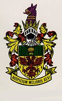
I stole this from the RJ homepage.
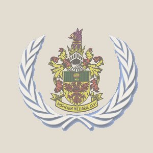
And wallah, nice logo!
Due to some negative feedback received:
"anyway i just noticed the "clever" little bit of graphic editing on the rmun handbook. they put their hideous rj badge (which is, revolting as it is, the same motif used for ri - which i take in my foul mood as another sign of chauvinism) between the twin olive(?) leaf thingies that's usually around the globe that makes up the UN symbol. it wasn't even particularly well done. the rj badge is far more grainy than the leaves. hah! lousy HISSOC. "
I conclude that they didn't use the nice one I did, but just used the lousy old one.
More weirdness is available at Gabriel's Homepage and Balderdash.

|

|
| Hosted by Homex | and Singapore ONE |