BY GREG MARTIN
The Concept
Model Railroading has in the past fifteen years evolved into a hobby of realism. The Modeler has shown that he expects more from his hobby than in the past and this isn’t his father's hobby anymore. What most modelers are looking for is a respectable amount of authenticity but he absolutely demands realism. What we expect is that what we have created is convincingly real, to his eye and the eyes of his colleagues. With this in mind we now find ourselves testing our skills at detailing locomotives, rolling stock, structures and the scene, but also to operate like the actual railroads and we want special effects like sound. Perhaps to this point our biggest compromise in our layouts is lighting. It is the one part of Mother Nature we cannot seem to fit into the layout room. Unfortunately without it, our eyes loose the details we have so diligently worked to add to our modeling. Dealing with a scaled down subject often the details we do add are lost to the lack of natural contrast that exists in the full scale subject and our models appear flat and lifeless even though the tool maker has worked hard to insure that the he has accurately replicated his subject. But alas, there is a solution to this and it is a fairly simple resolve.
I have practiced this technique for well over 12 years and it has gained several nicknames and for me several awards. As with almost any other technique in this hobby it comes with some investment in some special equipment or tools, but thank heavens the investment will likely cost less than your favorite locomotive. I have provided a list of tools as follows and they can be found at nearly any art supply dealer. We will need Black India Ink, a fine tipped inexpensive drawing pen, at least two packages of CONT� Crayon (dark and light sienna), White Charcoal pencil, a common #2 Soft graphite pencil, a pad of Post-it� and a set of colored pencils (the more colors the better). Some options are white and black CONT� crayon, black charcoal and different colors of ink.
HIGHLIGHTING
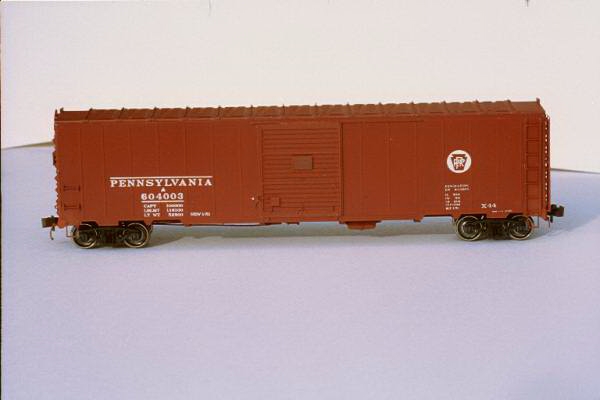 Let's begin by looking at a very finely detailed piece of
rolling stock that has been completed and would normally head to the bench for some common
weathering. Now I can't blame anyone for
using simple weathering techniques like airbrushing, using the Q-Tip technique, or the
powdered chalk technique. But as you can see
the details are rather flat and the subject is rather lifeless. This car needs something and as I was working on
this technique I was convinced that at this point it was not just weathering. I was
looking for something that whether I was standing 12-inches or 12-feet away from my
subject that I could see the same amount of detail as I was seeing on an actual subject. So I nosed around and like any good Railroad
Modeler I snooped around to see what the military modelers were doing about realism as I
had enjoyed years of military modeling and one of my favorite things was painting figures
as well as aircraft modeling. But I had been out of it a couple of years and so to my
discovery many modelers were using a technique they referred to as the "Verlinden
Technique" where a modeler would lightly airbrush a coat of thinned black along the
panel lines to offset and accentuate the area. I
looked at this and thought to myself that the concept was good but just as in drawing or
painting a picture if you want to truly accentuate the detail then enhance the area with
black and believe me this example shows why it needs to happen.
So I experimented and this is what works for me and will work for
you. Looking for every detail that stands off
the subject with your India ink and drawing pen trace or draw along the area to draw your
eyes 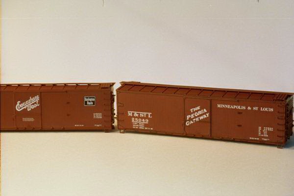 attention. In the case of
rolling stock it is nearly every detail that forms a right angle. Over the years I have learn that India ink may
work on the panel lines of a box car but on a light colored car like a yellow reefer or a
cement gray colored hopper you should, in most cases substitute a standard soft graphite
pencil to enhance the details but with less contrast then the India ink provides.
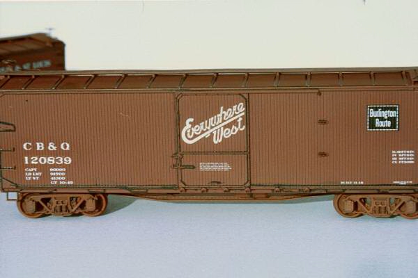 In this next photo you can see the
comparison of an ACCURAIL Car that has be highlighted completely and a car that has not.
Take a look… As you can se there is a
dramatic difference in what your eye perceives as detail in the car on the right that has
been highlighted in this case with the India ink. I found every possible detail that I
could and enhanced it with the ink. This car,
as a matter of fact, never had the grab irons removed and replaced and as the car is
finished you will see that there my very well have been no need to as the shading with
subdue the boldness of the black. Take a
closer look at the car with the ink highlighting. Gosh, some of you might say this is
really a nice and I like it so well I will stop here, well keep following along we are
just beginning to have fun. One sidebar to
all this is that through observation I have noticed that as you add the ink the car
suddenly appears darker. Although the detail
certainly is much clearer and this "look" would certainly be appealing under
most any lighting indoor or out, it to me needed more, something to bring the color back
into perspective. If you look closely you
will notice that the fish belly underframe has not escaped the pen and the advantage here
is that you help enhance something seldom noticed, but in the future it will catch the
exploring eye. Are we going to weather the car now? No, not yet. We are only about half the way there.
SHADOWING
Now we will move into the Shadowing portion of this process. I accomplish this by the use of contrasting colors of usually the same basic color. When you are using a pre-decorated car such as I have with all of these cars it is not possible to start with the exact color the manufacturer used, so close will work. I use basically three colors one is a constant, TESTORS Rubber, and then the basic color with red added to it and the basic color with orange added to it. I refer to these colors as "plus-Red and Plus-Orange". These two colors will need thinned much to the degree one might thin for weathering, remember we are adding a shade here not painting with the intend to make it as opaque as a new paint job. I start out with the Plus Red color and look to shadow the car from the top down. Apply a Post-it� to the rib to create a defined line between panels sections. At the roof I start at the panel to the extreme right and with my airbrush I spray along the walkway or peak of the roof and follow the panel down at the first roof rib allowing some of the overspray to fall onto the Post-it�. I continue this the entire length of the car and spin the car around and follow through with the opposite side in the same pattern. Then with the "plus-Red" still loaded in the airbrush I use a similar technique along the side of the car body. If the car has steel sides then I align the Post-it� on the panel line and moving again right to left I spray onto the panel in a random mottling pattern staying as close as possible to the left side of the panel. Again, I start along the top of the panel and down the seam. In the case a wood sheathed car such as these double-sheathed cars I begin right to left in a totally random vertical patterns never starting at the same height and spacing the pattern sometime closer together and at other time further apart.
Now with a quick change of color I spray the Plus-Orange color in
reverse starting again at the roof and covering the roof rib spray down the opposite side
and then along the lower edge of the roof. Again allow some of the color to overspray onto
the Post-it�. Then follow the same process
on the sides except work in opposite direction and work from the opposite side of the
panel. What you should now have achieved is
an overspray of Plus-Red light overspray to the right of the panel on both sides of the
car and a 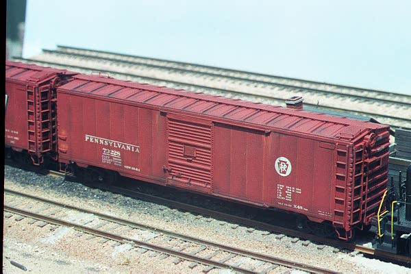 Plus-Orange overspray to the left side of the panel.
VARIATIONS
This technique works especially well on welded cars such as a Pullman Standard boxcar or covered hopper. The difference is that in order to better define the weld bead (scribing doesn't count) and individual panels you will need to first highlight the weld-bead with the graphite pencil and then with a contrasting color such as orange colored pencil for a boxcar paint freight car red. Look closely at the photo of my PRR X-45 boxcar and note the new panel lines. These weld-beads were simulated on a perfectly smooth car. The effect works well and doesn't not force the viewers eye to search for detail the detail comes to the modeler rather boldly.
WEATHERING
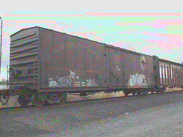
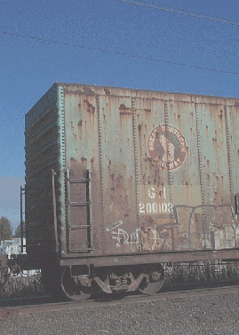
To finish off the model I weather the cars with what I would consider an appropriate amount of weathering to make the car look in service. For me this represents the use of TESTORS #1188 Rubber to simulate road grime and the use of Cont� crayon to represent the rust streaks, dark for old rust and light sienna for fresh rust. Here are a couple shots of actual cars taken recently in Salem, OR of welded cars that you can view as examples.
 |
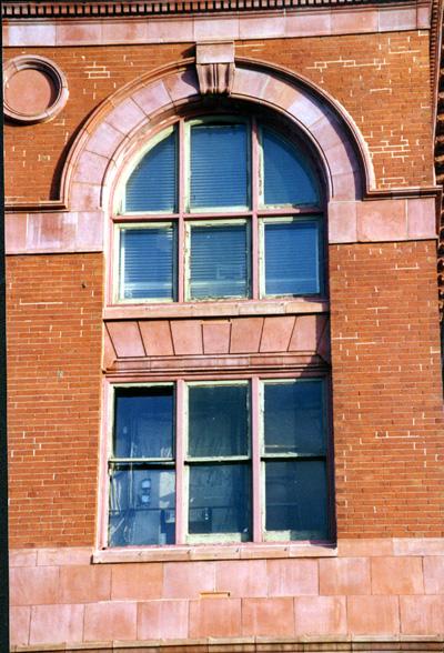 For structures the basics are the same as
you start your structure with a common color.
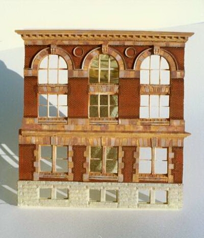 After the basic paint had dried I began
adding the highlighting by using a well-formed #1artist paintbrush and Floquil's Tuscan
Red, slightly thinned to the consistency of ink, for highlighting the surrounding tile
work and below the cornice work and once again any portion of the building that might
force a detail towards your eye.