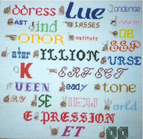
A mixture of languages, stitches, & fonts
When designing this, I didnt want it to look like it was off an assembly line, so I painstakingly made rules to follow.
Such as, no 2 words could B of the same font. Each word would have 1 signed letter in it shown
by a supposed hand in the letter position w/ finger markings. The sign for the letter being represented
is used in making the sign for the word following. If possible, there should B some congruity in the word & its portrayl;
such as tiny writing for cONDENSE, puter font for jOB, yarn colored blue for bLUE, purple designs for royal qUEEN, etc. Of course, there had to B some rhyme & reason
for placing the words where they R, but not too much nor too helter-skelter. I learned how difficult such a simple sounding thing can B!
The stitches other than the regular Continental, R LongStitch for denoting sides of fingers, XS for tRY, & BackStitch for the word cONDENSE.
I also made myself happy in another way : all yarn in the picture was leftover from previously done stitching. I believe in the 3 Rs (Recycle, Reuse, Reduce)!
To return to previous page, click on BACK internet command arrow
