Tips for Windows98

AND TOOLS FOR A BETTER HOMEPAGE

Check out these
very interesting 
#links! There's
something new
every now and again!

Now, to get started on the many aspects of Windows98 it's a good idea to organize it in a way that's easy to read. Last UpDate:13 aug 1999

Windows on the Web 

I have been making these pages using both Netscape Composerand Microsoft FrontPage-Express.There's not much difference between the two, basically it comes down to an extra webbot in FP-Express.A really usefull button inside Netscape Composer is the target-button.

 Tips for Builders: # The latest HTML, DhtmL, CSS and other info on http://ww3.org home of the world wide web consortium. # Adding tags manually has never been easier using FrontPage Xpress. (5th menu from the left choose "html-codes") # Always remember that forms need a script to work properly. Ask your ISP what possibilities you have.

GoTo Registry Tips

GoTo WebPage Building

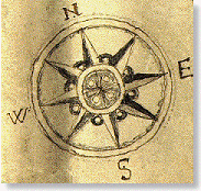
There is a lot more to discover... Take a random tour or browse systematically, it's all possible thanx to the imagemap!
aq

Windows 98;does it still have secrets for you? It shouldn't, not after you've followed these simple tips to get the most out of your system. They're all neatly organized into these sections:

Internet settings
Browser settings
Your HardDisk
The Registry
Programs and Viri
Documents & Accessories
Hardware
Laptops & Accessibility
NetWorking
Security
DOS & Ws Scripting Host
1.Internet Settings
    How to configure Windows to the modem

    UART & ISDN

    Accounts

    PPP & SLIP

    Dial-up Networking

    E-Mail

    Building you own webpages

    FrontPage Express

    Personal WebServer

    FTP & Uploading

    Downloading

    2.Browser settings

    Bookmarks

    Channels & Subscriptions

    Content Advisor

    Cookies, Java and Active-X Controls

    3. HardDisk

    Backup

    FAT

    FDISK

    MsConfig

The Windows 95 Registry 
 
collects information on software, hardware, and user preferences from several critical system files--system.dat, user.dat, win.ini, system.ini, and a handful of others. This information is stored in the three major types of Registry keys. (For ease of use, Win 95 duplicates three subkeys buried in the directory trees of the major keys, so you'll see six as you go.) The value of each key is set by the software you've installed or the information you've entered. 


But before you go messing around with the Registry, read and digest these seven rules--or there will be tears before bedtime. 
 

1. Know what you're dealing with.Everything you'll want to mess around with in the Registry can be found under three keys: HKEY_CLASSES_ROOT (file types, extensions, and files); HKEY_CURRENT_USER (personal profile information and customizations); and HKEY_LOCAL_MACHINE (hardware profiles). You can double-click almost any entry under these keys and edit them. But don't do it yet.


2. Keep a pristine backup.Before you mess around with anything else, you need to back up your Registry in the Microsoft Registry Editor (or regedit). Under the Registry menu, select Export Registry File, and make absolutely sure the All button is selected under Export Range. Save the information in a file with a name you'll remember (such as registry.txt), and keep it somewhere obvious, like on your PC desktop. Just to be safe, copy it to a floppy disk, too.
 

3. Know how to restore the Registry from your hard drive.In regedit, select Registry/Import, and point to the file you saved. Memorize this right now, and pray you won't have to use it.


4. Know how to restore the Registry from a floppy disk. If you can get into Windows 95 at all, select Start/Shut Down, and click "Restart the computer in MS-DOS mode." If Windows won't load, you need to use an emergency boot disk to start up your system. From there on, it's all DOS commands. Change to your Windows directory (for example, cd c:\\windows), then restore your Registry from the backup disk using these six DOS commands:

attrib -h -r -s system.dat 

attrib -h -r -s system.da0

copy system.da0 system.dat

attrib -h -r -s user.dat

attrib -h -r -s user.da0

copy user.da0 user.dat 

Try restarting your computer as you cross your fingers, fiddle with your rosary, and pray to the patron saint of losers who destroy their Registry.


5. Remember: you're on your own, buddy.Tweaking the Registry is risky. It can cause your system to lock up and crash. It can raise your blood pressure. It can ruin your career. It can cause severe static cling. It may be fun and even productive, but you're taking your system into your own hands.
 

6. Make only one change at a time......or people will laugh at you as your system refuses to boot.


7. Don't come crying to me if anything gets broken.It's good to note that if you muck with your Registry, screw it up, and then contact Microsoft for tech support, they're going to tell you to go away. And I will also disavow all knowledge of your mission or motivation. Get the picture? Back to top

HTML-Design

Some simple things to remember: Page Length, Graphics Image Maps, Navigation and Quality.
When a page fits into the browser-window you know you've done a good job. Like the fold in a newspaper, the bottom edge of the browser window will stop some people from reading further. If the page is only as long as the default browser window, your reader will see all that you present in a glance, and won't have to guess about what's below the edge of the window.
 Some content must be presented in one screen because the user cannot tell if there's more to be seen below the edge of the window.
 If you need to present short, clearly segmented chunks of information, you should try to keep your pages short so people won't miss things that fall off the end of the page.  If the content you present is in the form of short, loosely connected blocks, you must depend more heavily on layout and typography to organize your presentation. Keeping pages short will reduce the possibility that a block will be "orphaned" beyond the bottom edge of the browser window.
Graphics       back up
 Images can add a lot to the visual appeal and information content of a page. For some subjects and some readers, images may be the sole most effective means to communicate your message.  Well-used graphics can crystallize a presentation for a reader, providing a critical catalyst for understanding. Used poorly, images can confuse your audience, distract from your message, and render mute a critical message.
>Limit large images used solely for visual appeal.
>Keep the total size of all images used on a page to less than 30K.
>Use available technology tricks to minimize content access time.
>There are several available techniques to minimize download times for images:  Supply interlaced GIF files in your pages to allow images to load in multiple passes (i.e., the "window shade" or multi-layer effect.)
Image Maps          back up
Clearly delineate the click-able regions in an image map.
 If possible, make the clickable regions in an image map look like "buttons."
 Explain image-map ambiguities.  If there is any ambiguity about where to click on an image map, or what the destination of the links will be, describe the actions required and the effects of following the link to your audience.
 Provide alternate text links elsewhere on the page for image-map destinations.  This helps the people using text-only browsers, those who choose to browse with their images turned off, and those of us who might not be able to figure out what your image is supposed to do. If there are a large number of image-map destinations, and including links to all of them force using short link descriptions, you might be better off moving the list to another page.
Navigation and Quality back up
 Include document and chapter headings on long, multi-part documents.  If yours is an essentially hierarchical document having chapters or other predictable sections, consider adding a heading on each page that links back to beginning of the document. Also, for pages within each chapter or section, add a secondary header that takes readers back to the beginning of that chapter.
 Consider duplicating navigational headers at the bottom of your pages.  If your pages are consistently longer than one-and-a-half screens, it may be valuable to repeat any navigational links at the bottom of a page as well as putting them at the top, to help readers navigate without forcing them to always scroll to the top of your pages. If repeating the same navigational aid would look awkward, try a simplified version, offering only essential destinations
 Avoid "return to" or "back" buttons and links.  You have no way to predict whence someone came. Describe the destination of the link in absolute terms, rather than using implied destinations. "Previous" and "next" assume that people can predict your structure, and that they can quickly return if the destination wasn't what they expected. Neither of these assumptions is likely to be true. Your document structure will probably be foreign to many of your readers, and many of them will be running over low-bandwidth connections.


  HomeMusic & More...Tips & Trics for W98LOLinksSongtexts & MoreStory ofmy Life...Home