|
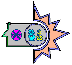
This picture
was a design I had to come up with for an international business firm.
The firm was to be a furniture store based in Aruba, whom, imported from
the United States. The image depicts the silhouette of an old Aruban
Cunucu house with a sun and traditional hex marks which were painted outside
of the Cunucu house. This symbol was designed in order to show the
Arubans that the firm had deep respect for their culture. |

|
Recently a group
of talented individuals and I wrote a script for a business class I had.
This movie was about two main characters and three companies. We
noticed that the companies where very different. Each one had their
own personality. This image shown above is the first logo, in order
to display the more layed back attitude, I designed this image with the
palm tree shades for Miami Shades. |

|
NY Style is the
other company that is competing with Miami Shades. NY Style is more
of a traditional company, with a hard work ethic. I designed this
image to give NY Style a distinct look. |

|
Nemesis International is the last company
that is featured in the movie. Nemesis is a company who's profit
lies in distribution throughout the Caribbean. This Image was designed
to show a powerful company in an ever emerging market. |

|
I designed this logo
for one of my class teams. The idea was to get a fresh and funky
feeling from the logo. |

|
This logo is for a
class project which intended to simulate a local, Miami based publication
for college students. The publication is a newsletter that talks
about money matters. |

|
This logo was part
of a class project. The logo represent a fictitious company which
is a cyber-cafe. |
