
Synopsis
Since our precedent study was on an existing rowhouse, our final was to design one. Actually, we were given imaginary clients who want a rowhouse with the rear burned down in a fire rebuilt. Since this rowhouse existed prior to the clients' requests, there were certain things that must remain the same. The front facade and the stairway were not allowed to be moved or changed in any way. The rest of the house is relatively flexible and changes were allowed to be made. Of course, the clients, two female adults who are sisters and an eleven year old son, had specifications which include a writer's studio space.
Assignment
Main Idea
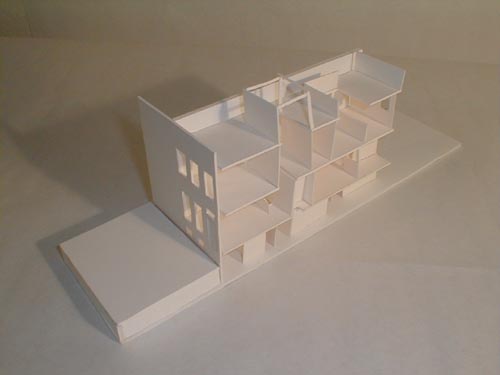
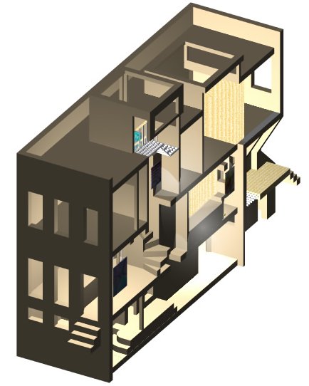
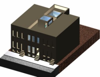
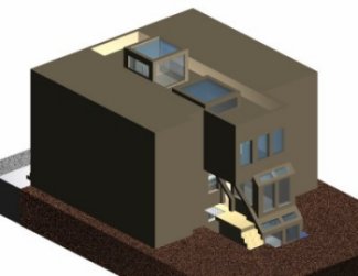
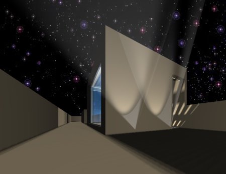
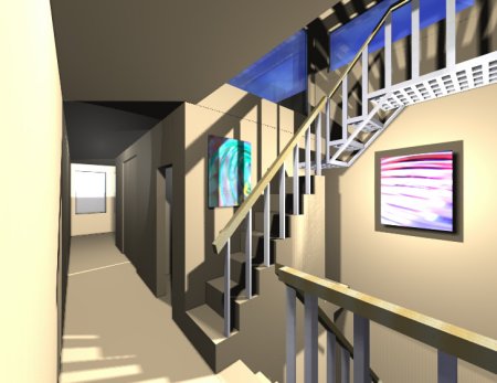
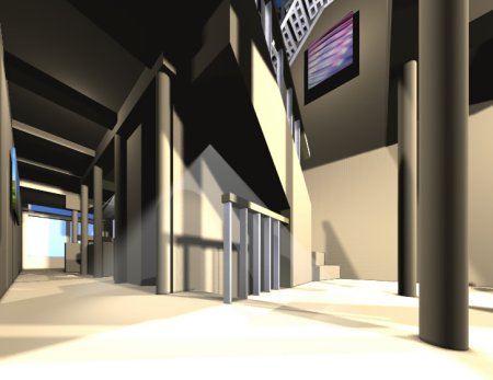
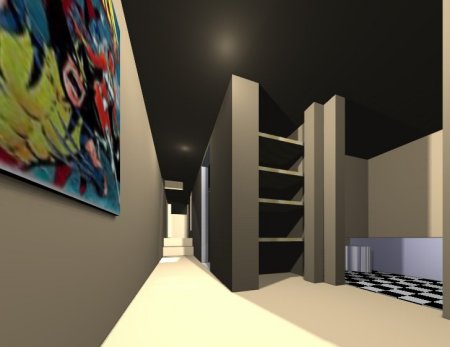
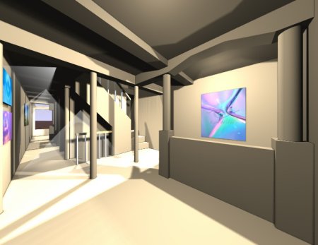
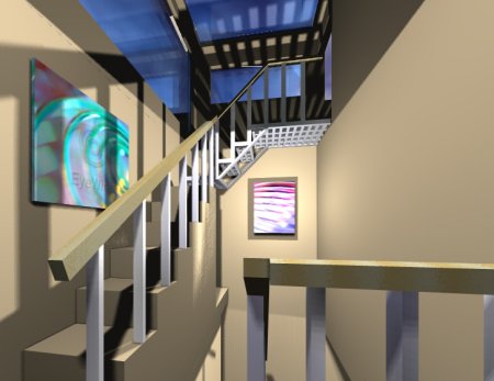
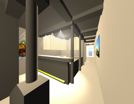
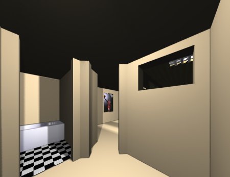
Since the spaces allowed were very small, I tried to leave the circulation off to the sides, out of the way, and have the paths very open, so that it looks larger than it really is. I also left the service spaces and other spaces that didn't need much sunlight in the middle, where the sunlight was the weakest. I had the main spaces on each end of the rowhouse, where the natural light was the greatest. I originally had the writers studio down in the basement, but I figured that it wouldn't be a very good place to have it so I moved it up to the top floor. I didn't want the writer's studio to be a seperate room but one that is a part of the room whose occupant uses the studio. So instead of making just a door, I used partitions that can fold in, out, or can just be taken off. I designed the partitions so that they can block off the entire hallway so that one of the partitions can be used as the door to her room, doubling the size of her room. Also, I wanted the teenager to more or less have the whole basement to himself for several reasons. First off, he is in a different generation than the other two occupants of the house. Therefore, he is probably much different than they are which means their habitats may differ to the point where they will annoy each other if placed too close together. Also, the form says that he tends to want privacy from the adults in the house when he has friends over. Having him in the basement would be the best solution to it. Also, I wanted a big penthouse-like object made of almost entirely glass to bring in light down the center of the rowhouse all the way down to the basement. Although it brought much light to the top two floors, it dimmed significantly as it hit the basement. But I positioned the light to drop down to the basement at the base of the stairs so it would seem like an "exit sign." Since I had the space, I decided to have stairs to lead up to the roof. I believe that I was the only one to do this. I thought it would be nice and worth the trouble since it opened up a world of new possibilities. They can stargaze on the roof, have a rooftop garden, spy on the cars and people that go past their house, and so on.
My Presentation
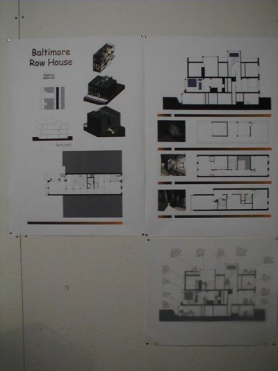
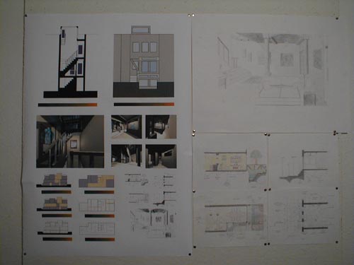
My presentation went rather well in my opinion despite the fact that one of the most feared critics reviewed me. I don't know. She didn't seem that bad. I was stuck in a dark corner with little space. I took this as a bad omen, but I guess I was wrong. I pinned up my three 24"x36" computer print outs then pinned up my hand-drawn ARCH202 work. It didn't come to a perfect rectangle as I hoped and I tried to fill up the space by putting my models in the gap, but it was blocking too much so I settled with an L shape. My first review came with a little twist. While I was presenting, the critic mentioned that she was actually supposed to be reviewing the media portion instead of the actual design. Unsure of what to present, I tried to improvise but ended up presenting mostly the design anyway. After a break, my second review commenced. I was more comfortable with this one since it was on the topic of design. Something that I prepared for. Still, some surprising questions came up such as why to place the dining room at one of the focal points of the building when the dining room will be used rarely. As always, I formulated something in my mind quickly to explain why and sticking a "I see what you mean, though. Perhaps I can..." at the end. After that came another break and a photo shoot. The last review was not better nor worse than the previous one. The critic seemed to like one of the assignments from ARCH202, but disliked my back facade. So most of the discussion revolved around those two elements. The ARCH 202 assignment was to think of what events might occur in the house at different times in a summer or winter day. I referred to it several times, saying that it helped me understand the activities and how to design the house to enhance the experience of those activities. Only after I said that did I realize the truth in it. Prior to that comment, I thought that assignment was rather useless. I was probably just flustered that we had to do so little on such expensive material. We had a review of the review at the end before taking down our projects and hauling them back into studio.
[Previous] [Home] [Next]