ARCH 182
Assignment 2
Calvin
Synopsis
This was a mandatory field trip to Mt. Angel Abbey Library designed by Alvar Aalto. It is located several miles north of Eugene and several miles south of Portland. It is not within a city or even a suburb but in a monastary on a hill nested in trees. It is a really beautiful place.

Assignment
  • Series of sketches

    Analysis
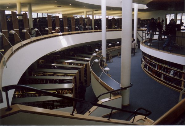
    When I reached the site, I wouldn't have been able to find the library if not for the stream of people walking toward a building. My first impression was: What's so special about this place? When I walked inside, my question was answered. It was stunning to walk into such an awesome place after the outside lowered my expectations. I realized that the library was in the ARCH201 lecture in the winter term. I recalled that the professor, Jim Givens, mentioned that the library was designed not to be the main focus of the place, contrary to what many architects would have done. Instead, Aalto wanted the church to be the main focus. The first thing I noticed when I walked in was the circular plan and the irregular shape of the circulation desk. I then noticed that the circulation desk was the center point of the fan-shaped back wall, pronounced by the wooden ceiling. All the bookshelves formed aisles that were not straight but went from narrow to wide in order to fit the fan-shaped building. There was a long skylight near the center of the building and light filtered down to the entrance level and further into the lower level although there was never any direct sunlight to damage the books or to distract people reading. My biggest complaint of the building besides the exterior roof shape, was his argument of people needing to concentrate on studying and not having a view. I thought that was not a very strong argument. In Jim Givens's lecture in ARCH201, he said "Architects are bad decision-makers." I strongly believe in that and believed that the job of the architect was not to make decisions but to offer options. Aalto's argument seems to be a decision made by the architect instead of an option offered by the architect.

    My Presentation
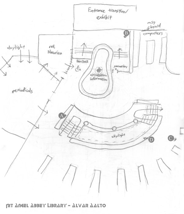
    At first, I didn't know there was an assignment of certain sketches and I was just sketching for my own reference. I toured the library then sat down at select places to sketch. I then did a floor plan and noted where I took each sketch. After lunch, I found out that there was an assignment so I went back in and did the assigned sketches and also noted the location of those in my floor plan.
    cluskillz


  • Sketched plan of the Mt. Angel Abbey Library

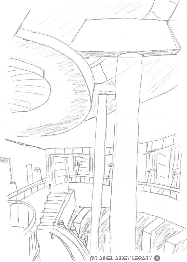
    Sketch of point A. This was for my reference and the view was chosen because it captured the main focus of the library which is the skylight and how it filters down into the lower level.

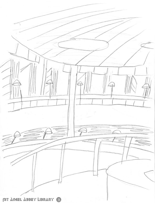
    Sketch of point B. This was my first sketch also for my reference. It was drawn before I went inside to look around. In other words, it was the first view I had of the inside.

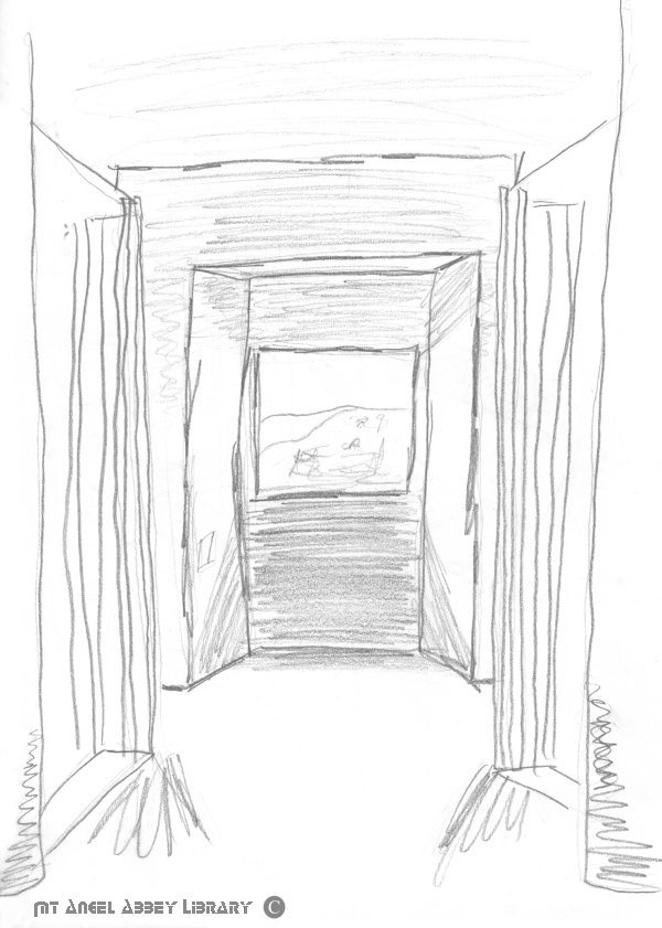
    Sketch of point C. This was an assigned sketch of a large window facing north, the back of the library.

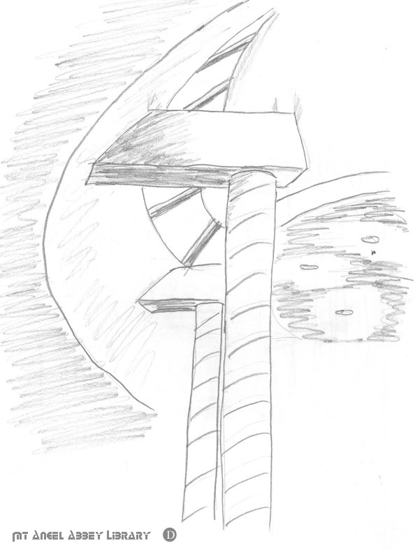
    Sketch of point D. This was another assigned sketch, much like point A but in the reverse direction. This one however, does a close-up on the structure in the close proximity of the skylights.

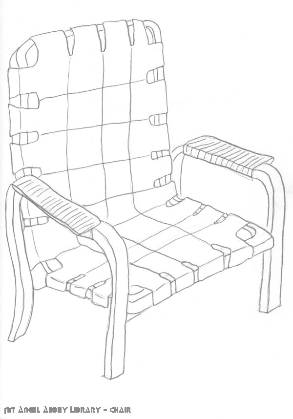
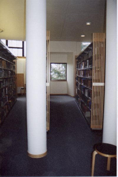
    Sketch of a chair. If this was not assigned, I may have never noticed the similarities between the furniture. I learned that Aalto designed the furniture himself. They contributed to the warmth and the consistency of the library with its wooden material.

    The following photographs courtesy of Gary Wong.
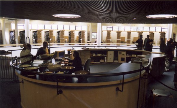
    Photo from the entry looking toward the rear of the library, with the circulation desk and the middle skylights in view.

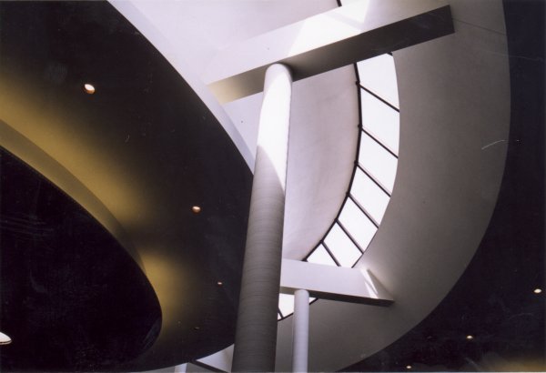
    Photo from the entry floor at the focus of the library, looking down into the lower floor. The opening allows much sunlight to filter into the lower floors.

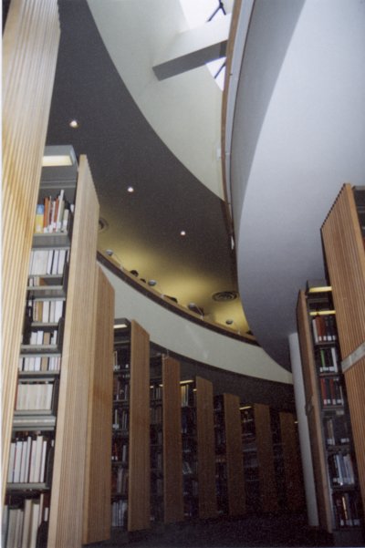
    Photo from the lower floor glancing up at the upper floor and skylight while also having a view of the bookshelves at the bottom.

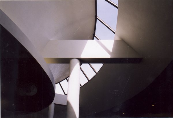
    Photo of a closeup of the structure that holds the skylight.

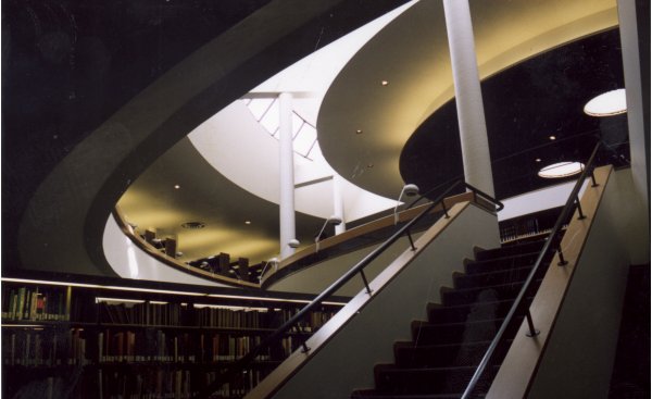
    Photo from the lower floor looking back up the stairs.

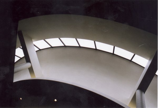
    Photo viewing the skylights.

    Photo looking straight up at the skylights.

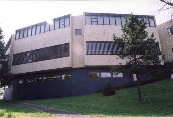
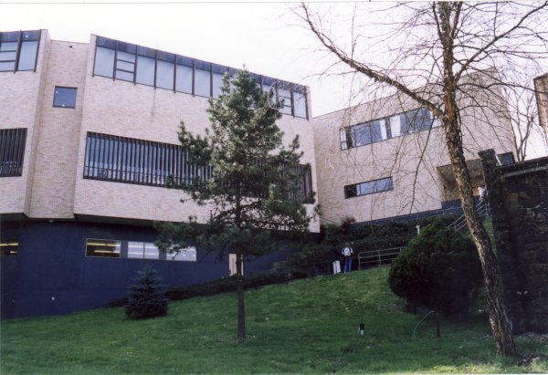
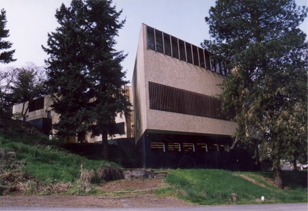
    Photo of the exterior view looking at the back of the library.

    Photo of the exterior view looking at the back of the library and the staff area.

    Photo of the exterior view looking at the back of the library and the periodicals room.

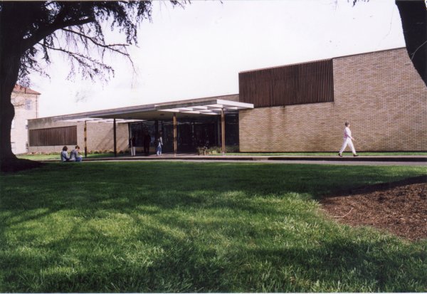
    Photo of the modest front view of the library.

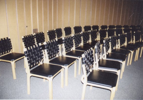
    Photo of the meeting room with a view of some Aalto furniture.

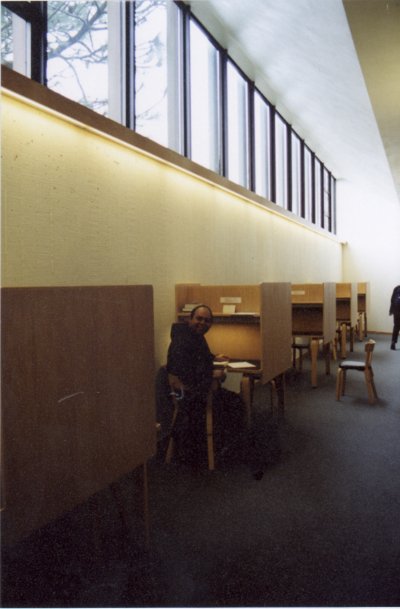
    Photo of the study carrols along the back of the wall. We tried to get a picture of him studying, but he somehow knew we were there and turned around to smile.

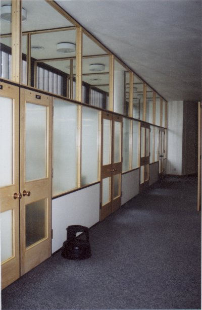
    Photo of study rooms along the back wall at the opposite end from the study carrols.

    Photo from the center looking at one of the larger windows that exposes the back view.

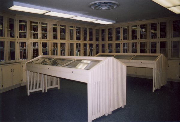
    Photo of the valuable books room. I was surprised how consistent the theme of the vertical wooden posts are.

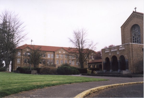
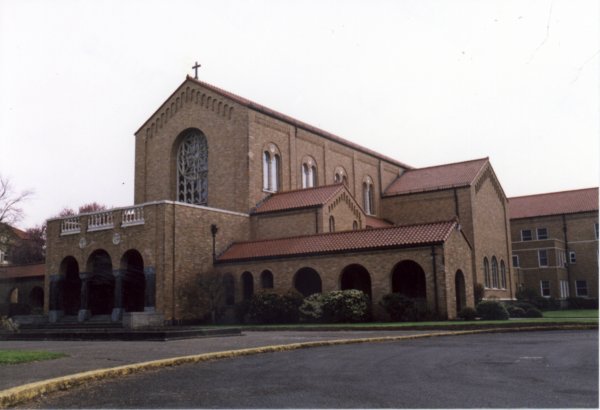
    Photo of the church, which Aalto wanted the main focus to be, and an adjacent building.

    Photo of the church.

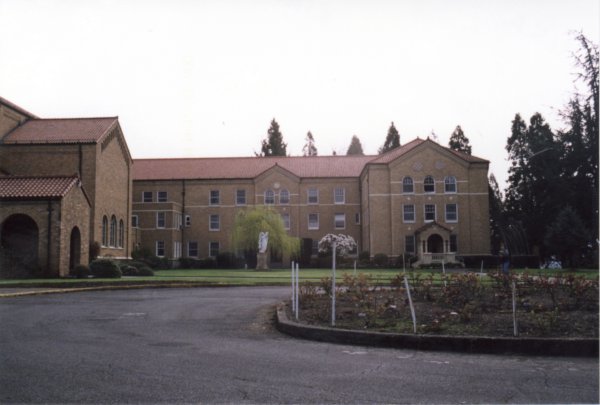
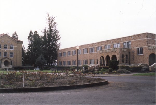
    Photo of surrounding buildings.

    Photo of surrounding buildings.


    [Previous] [Home] [Next]