
Synopsis
This assignment was to start us thinking up potential designs for the library. We were restricted from going into detail. We were only allowed to think of the five general spaces that compose the library: Circulation/Control, Reading Room, Stacks, Service/Support, and Entrance. This general design process allowed us to think of a structure that meets the demands of the client while having a strong relationship between spaces and a good artistic design.
Assignment
Main Idea
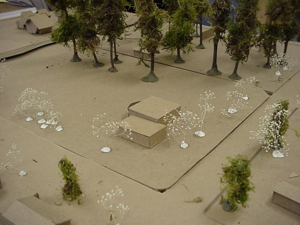
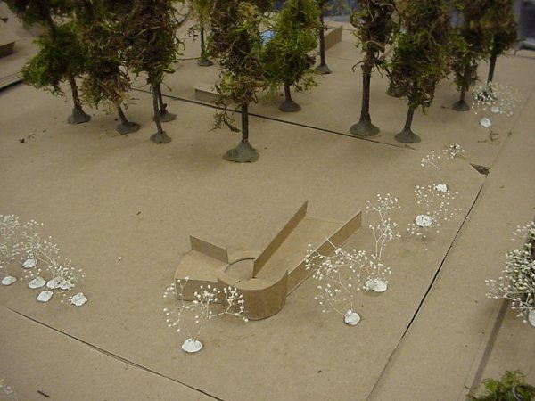
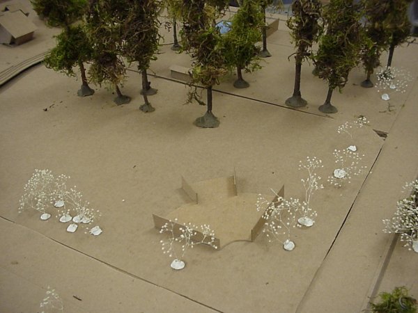
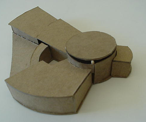
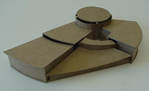
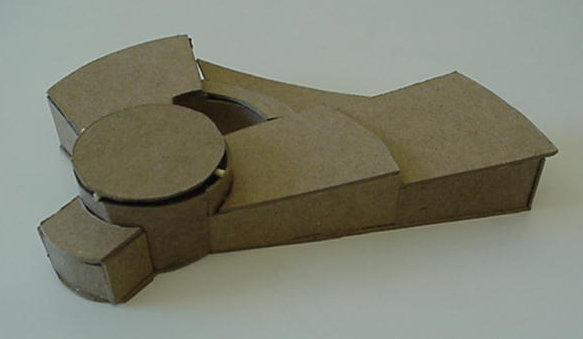
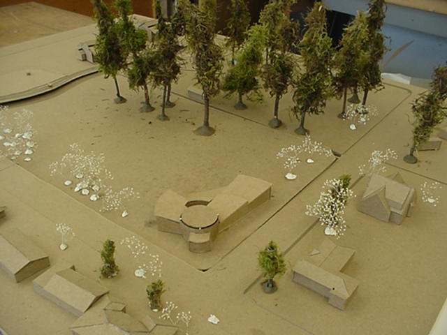
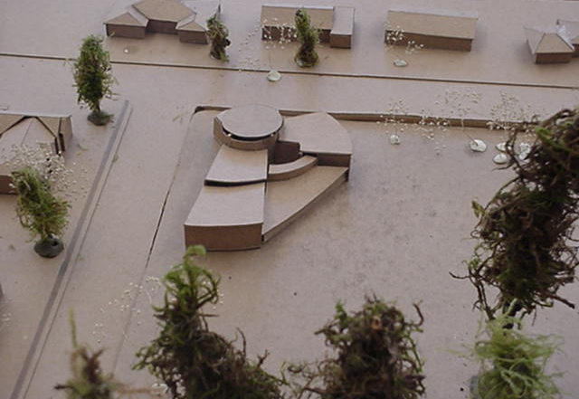
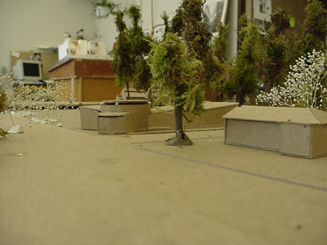
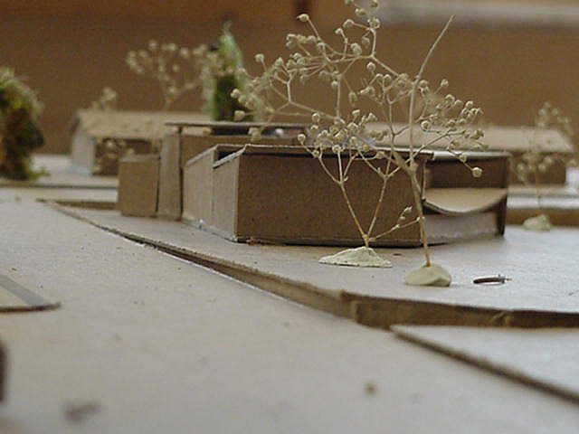
I already had an idea in my head, but it was rapidly losing ground as I formulated by second design. The first design had a very basic design. It was basically two boxes stuck together, with a clear heirarchy between the two. The fact that it was so basic bored me to death. Especially compared to my second one. I had no idea what I was doing or where I was headed with my second design. I decided to follow the Aalto radial design. So I started with a circle and tried to have arms branching out of it. The circle provided a natural tower and the tower created a natural entrance. The arms naturally fell into place as a boundary for the field which already had a boundary by the trees and shrubs. The arms also provided as a frame for the view of the rest of the park. I decided that it was a rather nice design, better than my first, so I decided to mimick that idea in my third one. I tried to use symmetry and cut away a circle instead of protruding one. I failed miserably at the attempt. The more I looked at the second design, the more I liked it so I then elaborated on it.
My Presentation
The presentation for this assignment was most interesting. Instead of explaining our library at the beginning, we were to cover up our diagrams and leave our three models out for others to diagram for us. This was to see if our design was clear and help us decide if we even want the design to be clear or not. The person who diagrammed my second model was almost accurate to what I was thinking of at the time. She put all the administrative in one wing and the reading room and stacks in the other. The circle was labeled as the entrance and control. Truth was, I planned for only half of the same wing to be administrative. But, my plan shifted so that entire wing was the administrative space. How perceptive.
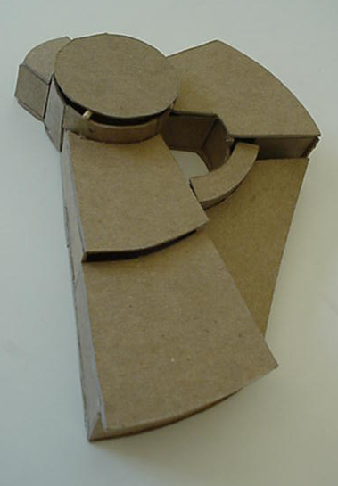
The following model underwent further changes.
[Previous] [Home] [Next]