The Macintosh Experience (continued)
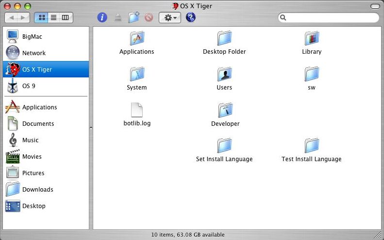
Here is a normal Finder window. At the upper left hand corner are "gumdropesque" buttons for closing, hiding, and maximizing the window. The middle label, "OS X Tiger",shows the location of the current window that is showing, which in this case is the contents of OS X Tiger, as you can see from the highlighted entry in blue on the left-hand panel. At the far right is a gray button which hides the options described next. Now back over to the left are the navigational buttons (similar to Windows) and the layout buttons. Here the user can choose to view everything as icons (currently selected and shown), as a list, or a path list. Some views are more efficient than others depending on what files are used and how frequently one accesses them. In the middle is a folder toolbar. From left to right are icons for getting information on a file, folder, or program; eject CD or DVD; add new folder; delete; custom actions; and connect to server. The toolbar can be customized by accessing the System Preferences and then simply dragging and dropping icons into the window. To the far right under the gray button is the Spotlight search engine. Here one can search the list of files or folders in the window, or search the whole disk or servers. | ||
On the left hand column are two lists. The upper part shows a list of disks and servers available, which like the window toolbar can be customized by the user. The bottom part shows locations of particular files and such. There are no hard fast rules, so one can put documents in the movies folder, pictures in the Applications folder, and so fourth. With Apple labeling these in the System Software, it just make things easier. When I load pictures from my digital camera into the computer, they default to being saved in the pictures folder. This can be changed to a different folder set by the user, but again it's just easier having these set automatically. Clicking on each icon in the list shows the files inside of the folder. Each icon can also be arranged in any order that the user chooses. Finally at the bottom is a status that shows how many items are in the currently viewed folder, while the bottom right hand corner is a button for the user to resize the window manually. |
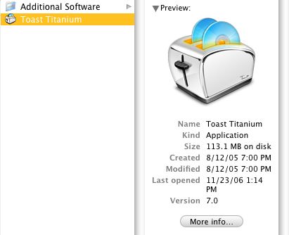 | Here is an item description shown in path mode with the window at original size. OS X has always had large, detailed, easy-to-read icons that are eye-pleasing and super slick. The information shows the name of the application, how much disk space the application takes up, the creation and modification dates, when the application was last opened, and the current version. Pressing the "More info..." button brings up a box similar to the previous example of getting information on the Mac OS X Tiger hard disk.
|
| Back to Page 1 |