Please, see the Terms of Usage on the Sets page for use of graphics.

Delightful Dingbats
Putting those picture fonts to work for you.
Plus some techniques for making more textures.
Caveat: I'm not sure this is a true tutorial, as much as it is a way of looking at things in order to utilize a certain type of dingbat.

There are tons of great dingbats out there. They are wonderful for making cutout effects and Blade Pro "jewelry". Those tend to be dingbats which have a certain "solidity" to them, such at the Fleurons dingbats. There are others which look more like engravings. (They are often painstakingly made from copies of such.) They are just too "thin" and complicated to use in the above effects. But, they are so beautiful, that I just had to find a use for them.
In this tutorial I will apply PSP 5 to a font called mollusks1 from Emerald City Fontworks. A demo copy of PSP can be downloaded from the Jasc site.

|
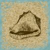
This is the letter "c" in the mollusks1 font. This font is derived from 19th century engravings. It really is pretty spiffy, but needs some help to make it more decorative. |
|
I start by creating a selection which consists of just the outline of the conch. I'll think that will be an exercise left to the reader. Everyone has their own way of obtaining that sort of selection, and it varies with the image. |
|
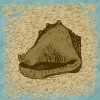
Once I have the selection, I flood fill it with a compatible color. In this case the HSL is 30, 91, 108. I could also use a pattern to fill. |
|
You might be able to tell that the above is a conch, but it doesn't have the pizzazz of the original. You can also use the selection to create objects in BladePro. |
|
All that needs to be done is to add the original dingbat back on top of the filled selection. The HSL is 30, 255, 32. Now, we have something. |
|
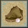
I did do a bit more in order to achieve the look in the border
background. These effects are applied to layers underneath the final font layer. Cutout:
This gives a bit of depth around the edges. Since I knew that I was going to use the pink conch pearl, I wanted to add a bit of pink to the conch. On another layer, I inverted the selection, and applied a pink drop shadow. Drop Shadow:
|

Making the textures
Sand
- Open a new file with a white background. Make it twice the size of the final tile you want to create. I used 200x200.
- Add uniform noise at 100%
- Convert to greyscale
- Convert back to 16 million colors
- Hotwax using a grey foreground swatch with level 240
- Adjust the brightness and contrast to get the effect you want. I boosted the brightness by 20% and lowered the contrast by 50%
- Resize to one half the original
- Colorize as desired. I used H=30 and S=92
Water
- Open a new file with a white background. Again, I made it 200x200 which is twice my final size.
- Add uniform noise at 100%
- Convert to greyscale
- Decrease the color depth to 4 bits (16 colors)
- Now, increase the color depth to 16 million colors
- Adjust the brightness and contrast. I lowered the brightness by 33% and boosted the contrast by 64%
- Mosaic by 5 pixels
- Motion blur at 45 degrees (or whatever you want) and 10 pixels (or twice what you mosaiced by.)
- Select a 100x100 section not too close to any edges
- Make this selection into a seamless tile.
- Colorize as desired. I used H=128 and S=56

 Any comments or questions are
welcome. Contact me via e-mail.


